Species which exist in fragmented, isolated and reduced populations have elevated extinction risk. Not only are they more susceptible to demographic and environmental stochasticity, which can easily wipe out small populations, but they also suffer from a range of genetic impacts. Notably, populations often lose significant amounts of genetic diversity as they reduce in size, potentially losing important adaptive diversity enabling them to respond to current and future environmental change. At the same time, random genetic drift becomes stronger relative to natural selection, reducing the efficacy of selection to be able to increase the frequency of favourable alleles and reduce the frequency of maladaptive ones. Together, these impacts create feedback loops which hasten the decline into the extinction vortex.
One very effective summary statistic that we might choose to use is the site-frequency spectrum (aka the allele frequency spectrum). Not to be confused with other measures of allele frequency which we’ve discussed before (like Fst), the site-frequency spectrum (abbreviated to SFS) is essentially a histogram of how frequent certain alleles are within our dataset. To do this, the SFS classifies each allele into a certain category based on how common it is, tallying up the number of alleles that occur at that frequency. The total number of categories would be the maximum number of possible alleles: for organisms with two copies of every chromosome (‘diploids’, including humans), this means that there are double the number of samples included. For example, a dataset comprised of genomic sequence for 5 people would have 10 different frequency bins.
An example of the 1DSFS for a single population, taken from a real dataset from my PhD. Left: the full site-frequency spectrum, counting how many alleles (y-axis) occur a certain number of times (categories of the x-axis) within the population. In this example, as in most species, the vast majority of our DNA sequence is non-variable (frequency = 0). Given the huge disparity in number of non-variable sites, we often select on the variable ones (and even then, often discard the 1 category to remove potential sequencing errors) and get a graph more like the right. Right: the ‘realistic’ 1DSFS for the population, showing a general exponential decline (the blue trendline) for the more frequent classes. This is pretty standard for an SFS. ‘Singleton’ and ‘doubleton’ are alternative names for ‘alleles which occur once’ and ‘alleles which occur twice’ in an SFS.
Expanding the SFS to multiple populations
Further to this, we can expand the site-frequency spectrum to compare across populations. Instead of having a simple 1-dimensional frequency distribution, for a pair of populations we can have a grid. This grid specifies how often a particular allele occurs at a certain frequency in Population A and at a different frequency in Population B. This can also be visualised quite easily, albeit as a heatmap instead. We refer to this as the 2-dimensional SFS (2DSFS).
An example of a 2DSFS, also taken from my PhD research. In this example, we are comparing Population A, containing 5 individuals (as diploid, 2 x 5 = max. of 10 occurrences of an allele) with Population B, containing 4 individuals. Each row denotes the frequency at which a certain allele occurs in Population B whilst the columns indicate the frequency a certain allele occurs in Population A. Each cell therefore indicates the number of alleles that occur at the exact frequency of the corresponding row and column. For example, the first cell (highlighted in green) indicates the number of alleles which are not found in either Population A or Population B (this dataset is a subsample from a larger one). The yellow cell indicates the number of alleles which occur 4 times in Population B and also 4 times in Population A. This could mean that in one of those Populations 4 individuals have one copy of that allele each, or two individuals have two copies of that allele, or that one has two copies and two have one copy. The exact composition of how the alleles are spread across samples within each population doesn’t matter to the overall SFS.
The same concept can be expanded to even more populations, although this gets harder to represent visually. Essentially, we end up with a set of different matrices which describe the frequency of certain alleles across all of our populations, merging them together into the joint SFS. For example, a joint SFS of 4 populations would consist of 6 (4 x 4 total comparisons – 4 self-comparisons, then halved to remove duplicate comparisons) 2D SFSs all combined together. To make sense of this, check out the diagrammatic tables below.
A summary of the different combinations of 2DSFSs that make up a joint SFS matrix. In this example we have 4 different populations (as described in the above text). Red cells denote comparisons between a population and itself – which is effectively redundant. Green cells contain the actual 2D comparisons that would be used to build the joint SFS: the blue cells show the same comparisons but in mirrored order, and are thus redundant as well.
Expanding the above jSFS matrix to the actual data, this matrix demonstrates how the matrix is actually a collection of multiple 2DSFSs. In this matrix, one particular cell demonstrates the number of alleles which occur at frequency xin one population and frequency yin another. For example, if we took the cell in the third row from the top and the fourth column from the left, we would be looking at the number of alleles which occur twice in Population B and three times in Population A. The colour of this cell is moreorless orange, indicating that ~50 alleles occur at this combination of frequencies. As you may notice, many population pairs show similar patterns, except for the Population C vs Population D comparison.
The different forms of the SFS
Which alleles we choose to use within our SFS is particularly important. If we don’t have a lot of information about the genomics or evolutionary history of our study species, we might choose to use the minor allele frequency (MAF). Given that SNPs tend to be biallelic, for any given locus we could have Allele A or Allele B. The MAF chooses the least frequent of these two within the dataset and uses that in the summary SFS: since the other allele’s frequency would just be 2N – the frequency of the other allele, it’s not included in the summary. An SFS made of the MAF is also referred to as the folded SFS.
Alternatively, if we know some things about the genetic history of our study species, we might be able to divide Allele A and Allele B into derived or ancestral alleles. Since SNPs often occur as mutations at a single site in the DNA, one allele at the given site is the new mutation (the derived allele) whilst the other is the ‘original’ (the ancestral allele). Typically, we would use the derived allele frequency to construct the SFS, since under coalescent theory we’re trying to simulate that mutation event. An SFS made of the derived alleles only is also referred to as the unfolded SFS.
Applications of the SFS
How can we use the SFS? Well, it can moreorless be used as a summary of genetic variation for many types of coalescent-based analyses. This means we can make inferences of demographic history (see here for more detailed explanation of that) without simulating large and complex genetic sequences and instead use the SFS. Comparing our observed SFS to a simulated scenario of a bottleneck and comparing the expected SFS allows us to estimate the likelihood of that scenario.
A representative example of how a bottleneck causes a shift in the SFS, based on a figure from a previous post on the coalescent. Centre: the diagram of alleles through time, with rarer variants (yellow and navy) being lost during the bottleneck but more common variants surviving (red). Left: this trend is reflected in the coalescent trees for these alleles, with red crosses indicating the complete loss of that allele. Right: the SFS from before (in red) and after (in blue) the bottleneck event for the alleles depicted. Before the bottleneck, variants are spread in the usual exponential shape: afterwards, however, a disproportionate loss of the rarer variants causes the distribution to flatten. Typically, the SFS would be built from more alleles than shown here, and extend much further.
A similar diagram as above, but this time with an expansion event rather than a bottleneck. The expansion of the population, and subsequent increase in Ne, facilitates the mutation of new alleles from genetic drift (or reduced loss of alleles from drift), causing more new (and thus rare) alleles to appear. This is shown by both the coalescent tree (left) and a shift in the SFS (right).
The SFS can even be used to detect alleles under natural selection. For strongly selected parts of the genome, alleles should occur at either high (if positively selected) or low (if negatively selected) frequency, with a deficit of more intermediate frequencies.
Adding to the analytical toolbox
The SFS is just one of many tools we can use to investigate the demographic history of populations and species. Using a combination of genomic technologies, coalescent theory and more robust analytical methods, the SFS appears to be poised to tackle more nuanced and complex questions of the evolutionary history of life on Earth.
A recurring analytical method, both within The G-CAT and the broader ecological genetic literature, is based on coalescent theory. This is based on the mathematical notion that mutations within genes (leading to new alleles) can be traced backwards in time, to the point where the mutation initially occurred. Given that this is a retrospective, instead of describing these mutation moments as ‘divergence’ events (as would be typical for phylogenetics), these appear as moments where mutations come back together i.e. coalesce.
Before we can explore the multitude of applications of the coalescent, we need to understand the fundamental underlying model. The initial coalescent model was described in the 1980s, built upon by a number of different ecologists, geneticists and mathematicians. However, John Kingman is often attributed with the formation of the original coalescent model, and the Kingman’s coalescent is considered the most basic, primal form of the coalescent model.
From a mathematical perspective, the coalescent model is actually (relatively) simple. If we sampled a single gene from two different individuals (for simplicity’s sake, we’ll say they are haploid and only have one copy per gene), we can statistically measure the probability of these alleles merging back in time (coalescing) at any given generation. This is the same probability that the two samples share an ancestor (think of a much, much shorter version of sharing an evolutionary ancestor with a chimpanzee).
Normally, if we were trying to pick the parents of our two samples, the number of potential parents would be the size of the ancestral population (since any individual in the previous generation has equal probability of being their parent). But from a genetic perspective, this is based on the genetic (effective) population size (Ne), multiplied by 2 as each individual carries two copies per gene (one paternal and one maternal). Therefore, the number of potential parents is 2Ne.
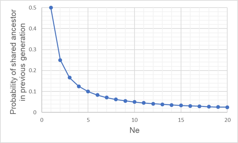
A graph of the probability of a coalescent event (i.e. two alleles sharing an ancestor) in the immediatelypreceding generation (i.e. parents) relatively to the size of the population. As one might expect, with larger population sizes there is low chance of sharing an ancestor in the immediately prior generation, as the pool of ‘potential parents’ increases.
If we have an idealistic population, with large Ne, random mating and no natural selection on our alleles, the probability that their ancestor is in this immediate generation prior (i.e. share a parent) is 1/(2Ne). Inversely, the probability they don’t share a parent is 1 − 1/(2Ne). If we add a temporal component (i.e. number of generations), we can expand this to include the probability of how many generations it would take for our alleles to coalesce as (1 – (1/2Ne))t-1 x 1/2Ne.
The probability of two alleles sharing a coalescent event back in time under different population sizes. Similar to above, there is a higher probability of an earlier coalescent event in smaller populations as the reduced number of ancestors means that alleles are more likely to ‘share’ an ancestor. However, over time this pattern consistently decreases under all population size scenarios.
Although this might seem mathematically complicated, the coalescent model provides us with a scenario of how we would expect different mutations to coalesce back in time if those idealistic scenarios are true. However, biology is rarely convenient and it’s unlikely that our study populations follow these patterns perfectly. By studying how our empirical data varies from the expectations, however, allows us to infer some interesting things about the history of populations and species.
A diagram of how the coalescent can be used to detect bottlenecks in a single population (centre). In this example, we have contemporary population in which we are tracing the coalescence of two main alleles (red and green, respectively). Each circle represents a single individual (we are assuming only one allele per individual for simplicity, but for most animals there are up to two). Looking forward in time, you’ll notice that some red alleles go extinct just before the bottleneck: they are lost during the reduction in Ne. Because of this, if we measure the rate of coalescence (right), it is much higher during the bottleneck than before or after it. Another way this could be visualised is to generate gene trees for the alleles (left): populations that underwent a bottleneck will typically have many shorter branches and a long root, as many branches will be ‘lost’ by extinction (the dashed lines, which are not normally seen in a tree).
This makes sense from theoretical perspective as well, since strong genetic bottlenecks means that most alleles are lost. Thus, the alleles that we do have are much more likely to coalesce shortly after the bottleneck, with very few alleles that coalesce before the bottleneck event. These alleles are ones that have managed to survive the purge of the bottleneck, and are often few compared to the overarching patterns across the genome.
Testing migration (gene flow) across lineages
Another demographic factor we may wish to test is whether gene flow has occurred across our populations historically. Although there are plenty of allele frequency methods that can estimate contemporary gene flow (i.e. within a few generations), coalescent analyses can detect patterns of gene flow reaching further back in time.
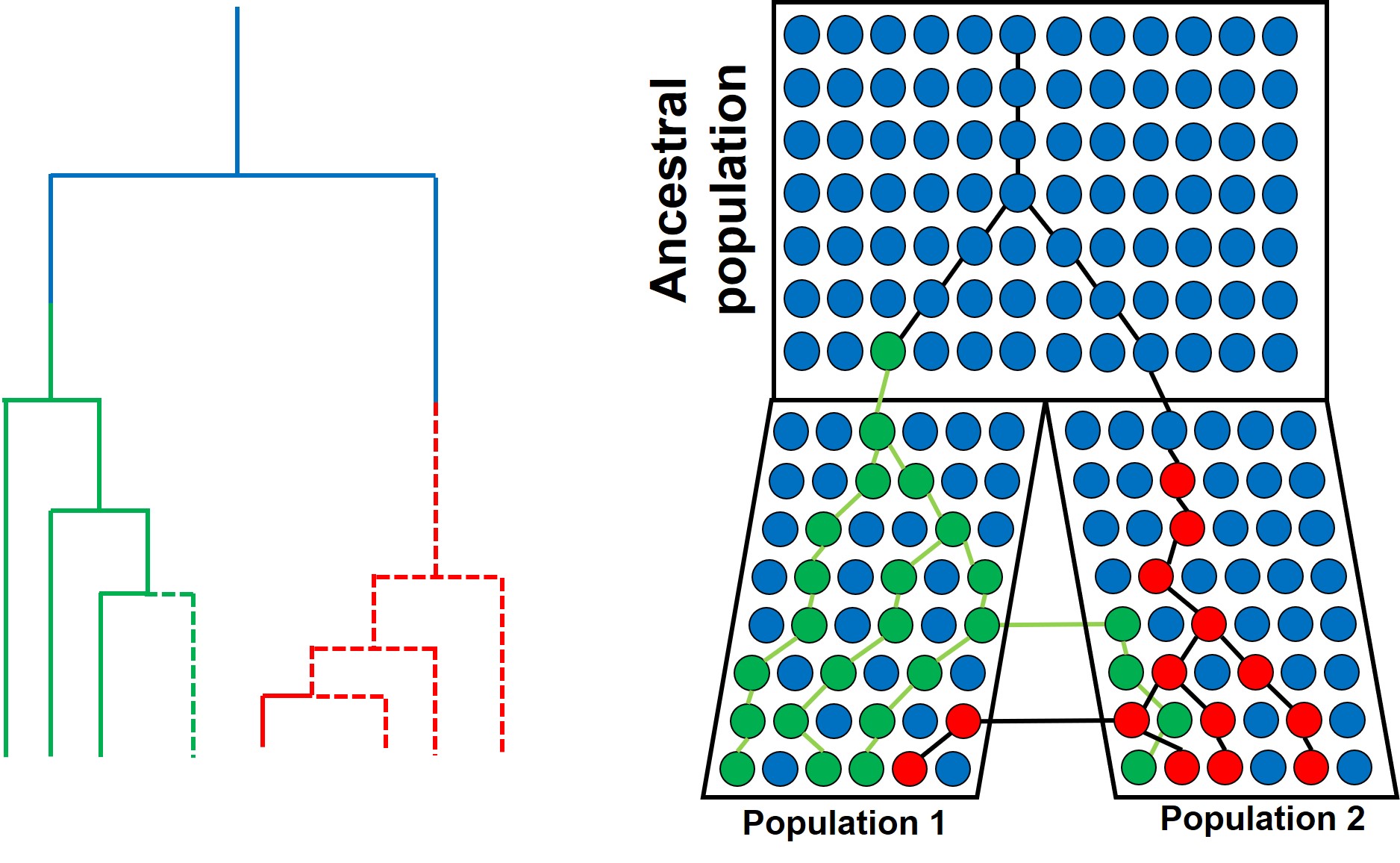
A similar model of coalescence as above, but testing for migration rate (gene flow) in two recently diverged populations (right). In this example, when we trace two alleles (red and green) back in time, we notice that some individuals in Population 1 coalesce more recently with individuals of Population 2 than other individuals of Population 1 (e.g. for the red allele), and vice versa for the green allele. This can also be represented with gene trees (left), with dashed lines representing individuals from Population 2 and whole lines representing individuals from Population 1. This incomplete split between the two populations is the result of migration transferring genes from one population to the other after their initial divergence (also called ‘introgression’ or ‘horizontal gene transfer’).
Testing divergence time
In a similar vein, the coalescent can also be used to test how long ago the two contemporary populations diverged. Similar to gene flow, this is often included as an additional parameter on top of the coalescent model in terms of the number of generations ago. To convert this to a meaningful time estimate (e.g. in terms of thousands or millions of years ago), we need to include a mutation rate (the number of mutations per base pair of sequence per generation) and a generation time for the study species (how many years apart different generations are: for humans, we would typically say ~20-30 years).
An example of using the coalescent to test the divergence time between two populations, this time using three different alleles (red, green and yellow). Tracing back the coalescence of each alleles reveals different times (in terms of which generation the coalescence occurs in) depending on the allele (right). As above, we can look at this through gene trees (left), showing variation how far back the two populations (again indicated with bold and dashed lines respectively) split. The blue box indicates the range of times (i.e. a confidence interval) around which divergence occurred: with many more alleles, this can be more refined by using an ‘average’ and later related to time in years with a generation time.
While each of these individual concepts may seem (depending on how well you handle maths!) relatively simple, one critical issue is the interactive nature of the different factors. Gene flow, divergence time and population size changes will all simultaneously impact the distribution and frequency of alleles and thus the coalescent method. Because of this, we often use complex programs to employ the coalescent which tests and balances the relative contributions of each of these factors to some extent. Although the coalescent is a complex beast, improvements in the methodology and the programs that use it will continue to improve our ability to infer evolutionary history with coalescent theory.
A number of timesbefore on The G-CAT, we’ve discussed the idea of using the frequency of different genetic variants (alleles) within a particular population or species to test a number of different questions about evolution, ecology and conservation. These are all based on the central notion that certain forces of nature will alter the distribution and frequency of alleles within and across populations, and that these patterns are somewhat predictable in how they change.
One particular distinction we need to make early here is the difference between allele frequency and allele identity. In these analyses, often we are working with the same alleles (i.e. particular variants) across our populations, it’s just that each of these populations may possess these particular alleles in different frequencies. For example, one population may have an allele (let’s call it Allele A) very rarely – maybe only 10% of individuals in that population possess it – but in another population it’s very common and perhaps 80% of individuals have it. This is a different level of differentiation than comparing how different alleles mutate (as in the coalescent) or how these mutations accumulate over time (like in many phylogenetic-based analyses).
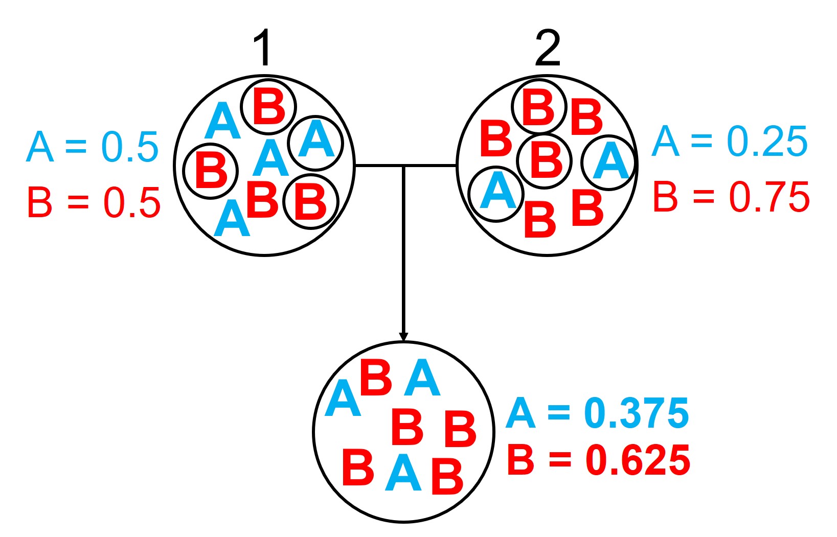
An example of the difference between allele frequency and identity.In this example (and many of the figures that follow in this post), the circle denote different populations, within which there are individuals which possess either an A gene (blue) or a B gene. Left: If we compared Populations 1 and 2, we can see that they both have A and B alleles. However, these alleles vary in their frequency within each population, with an equal balance of A and B in Pop 1 and a much higher frequency of B in Pop 2. Right: However, when we compared Pop 3 and 4, we can see that not only do they vary in frequencies, they vary in the presence of alleles, with one allele in each population but not the other.
An example of how gene flow across populations homogenises allele frequencies. We start with two initial populations (1 and 2 from above), which have very different allele frequencies. Hybridising individuals across the two populations means some alleles move from Pop 1 and Pop 2 into the hybrid population: which alleles moves is random (the smaller circles). Because of this, the resultant hybrid population has an allele frequency somewhere in between the two source populations: think of like mixing red and blue cordial and getting a purple drink.
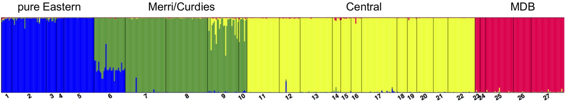
An example of a Structure plot which long-term The G-CAT readers may be familiar with. This is taken from Brauer et al. (2013), where the authors studied the population structure of the Yarra pygmy perch. Each small column represents a single individual, with the colours representing how well the alleles of that individual fit a particular genetic population (each population has one colour). The numbers and broader columns refer to different ‘localities’ (different from populations) where individuals were sourced. This shows clear strong population structure across the 4 main groups, except for in Locality 6 where there is a mixture of Eastern and Merri/Curdies alleles.
Determining genetic bottlenecks and demographic change
A diagram of how allele frequencies change in genetic bottlenecks due to genetic drift. Left: Large circles again denote a population (although across different sequential times), with smaller circle denoting which alleles survive into the next generation (indicated by the coloured arrows). We start with an initial ‘large’ population of 8, which is reduced down to 4 and 2 in respective future times. Each time the population contracts, only a select number of alleles (or individuals) ‘survive’: assuming no natural selection is in process, this is totally random from the available gene pool. Right: We can see that over time, the frequencies of alleles A and B shift dramatically, leading to the ‘extinction’ of Allele B due to genetic drift. This is because it is the less frequent allele of the two, and in the smaller population size has much less chance of randomly ‘surviving’ the purge of the genetic bottleneck.
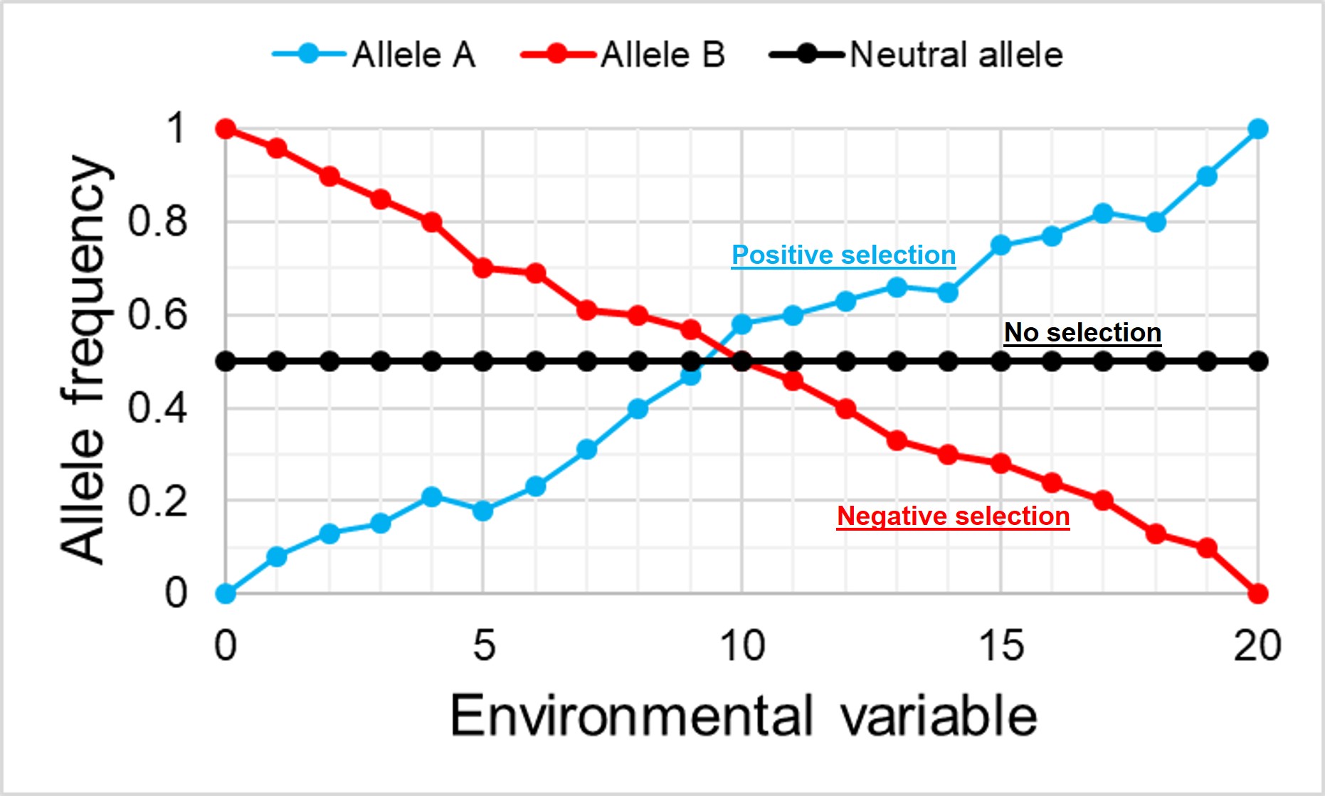
An example of how the frequency of alleles might vary under natural selection in correlation to the environment. In this example, the blue allele A is adaptive and under positive selection in the more intense environment, and thus increases in frequency at higher values. Contrastingly, the red allele B is maladaptive in these environments and decreases in frequency. For comparison, the black allele shows how the frequency of a neutral (non-adaptive or maladaptive) allele doesn’t vary with the environment, as it plays no role in natural selection.
Fixed differences are sometimes used as a type of diagnostic trait for species. This means that each ‘species’ has genetic variants that are not shared at all with its closest relative species, and that these variants are so strongly under selection that there is no diversity at those loci. Often, fixed differences are considered a level above populations that differ by allelic frequency only as these alleles are considered ‘diagnostic’ for each species.
An example of the difference between fixed differences and allelic frequency differences. In this example, we have 5 cats from 3 different species, sequencing a particular target gene. Within this gene, there are three possible alleles: T, A or G respectively. You’ll quickly notice that the T allele is both unique to Species A and is present in all cats of that species (i.e. is fixed). This is a fixed difference between Species A and the other two. Alleles A and G, however, are present in both Species B and C, and thus are not fixed differences even if they have different frequencies.
To distinguish between the two, we often use the overall frequency of alleles in a population as a basis for determining how likely two individuals share an allele by random chance. If alleles which are relatively rare in the overall population are shared by two individuals, we expect that this similarity is due to family structure rather than population history. By factoring this into our relatedness estimates we can get a more accurate overview of how likely two individuals are to be related using genetic information.
The wild world of allele frequency
Despite appearances, this is just a brief foray into the many applications of allele frequency data in evolution, ecology and conservation studies. There are a plethora of different programs and methods that can utilise this information to address a variety of scientific questions and refine our investigations.