Two Worlds: contrasting Australia’s temperate regions

Temperate Australia

Australia is renowned for its unique diversity of species, and likewise for the diversity of ecosystems across the island continent. Although many would typically associate Australia with the golden sandy beaches, palm trees and warm weather of the tropical east coast, other ecosystems also hold both beautiful and interesting characteristics. Even the regions that might typically seem the dullest – the temperate zones in the southern portion of the continent – themselves hold unique stories of the bizarre and wonderful environmental history of Australia.

The two temperate zones

Within Australia, the temperate zone is actually separated into two very distinct and separate regions. In the far south-western corner of the continent is the southwest Western Australia temperate zone, which spans a significant portion. In the southern eastern corner, the unnamed temperate zone spans from the region surrounding Adelaide at its westernmost point, expanding to the east and encompassing Tasmanian and Victoria before shifting northward into NSW. This temperate zones gradually develops into the sub-tropical and tropical climates of more northern latitudes in Queensland and across to Darwin.


Labelled Koppen-Geiger map
The climatic classification (Koppen-Geiger) of Australia’s ecosystems, derived from the Atlas of Living Australia. The light blue region highlights the temperate zones discussed here, with an isolated region in the SW and the broader region of the SE as it transitions into subtropical and tropical climates northward.

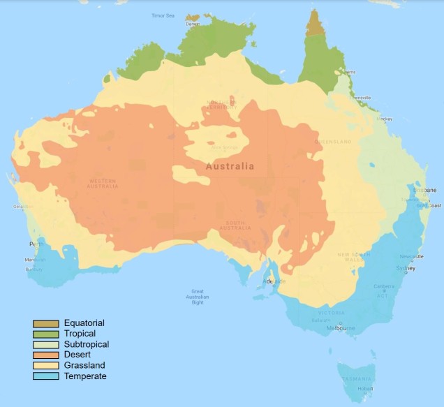
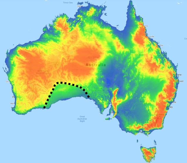
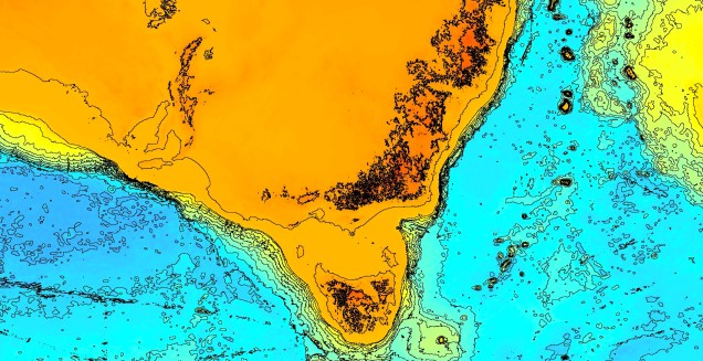
The divide separating these two regions might be familiar to some readers – the Nullarbor Plain. Not just a particularly good location for fossils and mineral ores, the Nullarbor Plain is an almost perfectly flat arid expanse that stretches from the western edge of South Australia to the temperate zone of the southwest. As the name suggests, the plain is totally devoid of any significant forestry, owing to the lack of available water on the surface. This plain is a relatively ancient geological structure, and finished forming somewhere between 14 and 16 million years ago when tectonic uplift pushed a large limestone block upwards to the surface of the crust, forming an effective drain for standing water with the aridification of the continent. Thus, despite being relatively similar bioclimatically, the two temperate zones of Australia have been disconnected for ages and boast very different histories and biota.

Elevation map of NP.jpg
A map of elevation across the Australian continent, also derived from the Atlas of Living Australia. The dashed black line roughly outlines the extent of the Nullarbor Plain, a massively flat arid expanse.

The hotspot of the southwest

The southwest temperate zone – commonly referred to as southwest Western Australia (SWWA) – is an island-like bioregion. Isolated from the rest of the temperate Australia, it is remarkably geologically simple, with little topographic variation (only the Darling Scarp that separates the lower coast from the higher elevation of the Darling Plateau), generally minor river systems and low levels of soil nutrients. One key factor determining complexity in the SWWA environment is the isolation of high rainfall habitats within the broader temperate region – think of islands with an island.

SSWA environment.jpg
A figure demonstrating the environmental characteristics of SWWA, using data from the Atlas of Living AustraliaLeft: An elevation map of the region, showing some mountainous variation, but only one significant steep change along the coast (blue area). Right: A summary of 19 different temperature and precipitation variables, showing a relatively weak gradient as the region shifts inland.

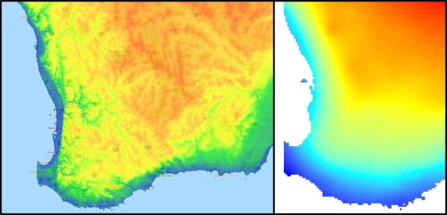
Despite the lack of geological complexity and the perceived diversity of the tropics, the temperate zone of SWWA is the only internationally recognised biodiversity hotspot within Australia. As an example, SWWA is inhabited by ~7,000 different plant species, half of which are endemic to the region. Not to discredit the impressive diversity of the rest of the continent, of course. So why does this area have even higher levels of species diversity and endemism than the rest of mainland Australia?

speciation patterns in SWWA.jpg
A demonstration of some of the different patterns which might explain the high biodiversity of SWWA, from Rix et al. (2015). These predominantly relate to different biogeographic mechanisms that might have driven diversification in the region, from survivors of the Gondwana era to the more recent fragmentation of mesic habitats.

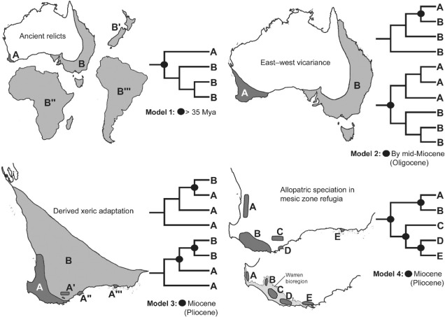
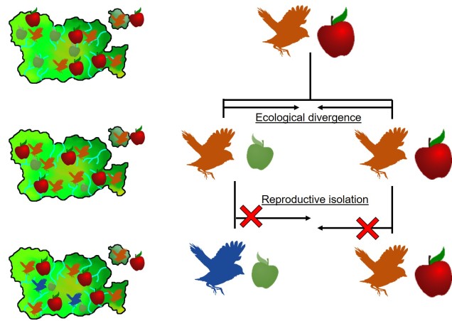
Well, a number of factors may play significant roles in determining this. One of these is the ancient and isolated nature of the region: SWWA has been separated from the rest of Australia for at least 14 million years, with many species likely originating much earlier than this. Because of this isolation, species occurring within SWWA have been allowed to undergo adaptive divergence from their east coast relatives, forming unique evolutionary lineages. Furthermore, the southwest corner of the continent was one of the last to break away from Antarctica in the dismantling of Gondwana >30 million years ago. Within the region more generally, isolation of mesic (wetter) habitats from the broader, arid (xeric) habitats also likely drove the formation of new species as distributions became fragmented or as species adapted to the new, encroaching xeric habitat. Together, this varies mechanisms all likely contributed in some way to the overall diversity of the region.

The temperate south-east of Australia

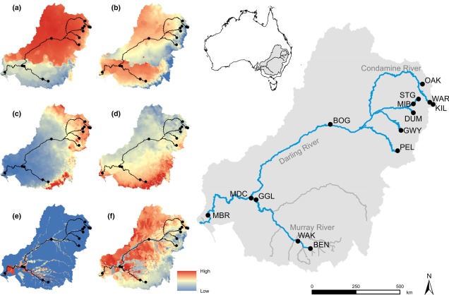
Contrastingly, the temperate region in the south-east of the continent is much more complex. For one, the topography of the zone is much more variable: there are a number of prominent mountain chains (such as the extended Great Dividing Range), lowland basins (such as the expansive Murray-Darling Basin) and variable valley and river systems. Similarly, the climate varies significantly within this temperate region, with the more northern parts featuring more subtropical climatic conditions with wetter and hotter summers than the southern end. There is also a general trend of increasing rainfall and lower temperatures along the highlands of the southeast portion of the region, and dry, semi-arid conditions in the western lowland region.

MDB map
A map demonstrating the climatic variability across the Murray-Darling Basin (which makes up a large section of the SE temperate zone), from Brauer et al. (2018). The different heat maps on the left describe different types of variables; a) and b) represent temperature variables, c) and d) represent precipitation (rainfall) variables, and e) and f) represent water flow variables. Each variable is a summary of a different set of variables, hence the differences.

A complicated history

The south-east temperate zone is not only variable now, but has undergone some drastic environmental changes over history. Massive shifts in geology, climate and sea-levels have particularly altered the nature of the area. Even volcanic events have been present at some time in the past.

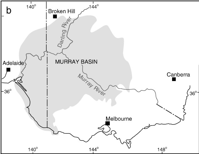
One key hydrological shift that massively altered the region was the paleo-megalake Bungunnia. Not just a list of adjectives, Bungunnia was exactly as it’s described: a historically massive lake that spread across a huge area prior to its demise ~1-2 million years ago. At its largest size, Lake Bungunnia reached an area of over 50,000 km­­­2, spreading from its westernmost point near the current Murray mouth although to halfway across Victoria. Initially forming due to a tectonic uplift event along the coastal edge of the Murray-Darling Basin ~3.2 million years ago, damming the ancestral Murray River (which historically outlet into the ocean much further east than today). Over the next few million years, the size of the lake fluctuated significantly with climatic conditions, with wetter periods causing the lake to overfill and burst its bank. With every burst, the lake shrank in size, until a final break ~700,000 years ago when the ‘dam’ broke and the full lake drained.

Lake Bungunnia map 2.jpg
A map demonstrating the sheer size of paleo megalake Bungunnia at it’s largest extent, taken from McLaren et al. (2012).

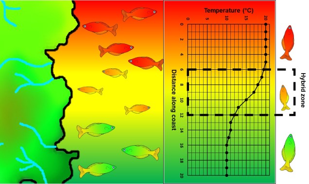
Another change in the historic environment readers may be more familiar with is the land-bridge that used to connect Tasmania to the mainland. Dubbed the Bassian Isthmus, this land-bridge appeared at various points in history of reduced sea-levels (i.e. during glacial periods in Pleistocene cycle), predominantly connecting via the still-above-water Flinders and Cape Barren Islands. However, at lower sea-levels, the land bridge spread as far west as King Island: central to this block of land was a large lake dubbed the Bass Lake (creative). The Bassian Isthmus played a critical role in the migration of many of the native fauna of Tasmania (likely including the Indigenous peoples of the now-island), and its submergence and isolation leads to some distinctive differences between Tasmanian and mainland biota. Today, the historic presence of the Bassian Isthmus has left a distinctive mark on the genetic make-up of many species native to the southeast of Australia, including dolphins, frogs, freshwater fishes and invertebrates.

Bass Strait bathymetric contours.jpg
An elevation (Etopo1) map demonstrating the now-underwater land bridge between Tasmania and the mainland. Orange colours denote higher areas whilst light blue represents lower sections.

Don’t underestimate the temperates

Although tropical regions get most of the hype for being hotspots of biodiversity, the temperate zones of Australia similarly boast high diversity, unique species and document a complex environmental history. Studying how the biota and environment of the temperate regions has changed over millennia is critical to predicting the future effects of climatic change across large ecosystems.

The reality of neutrality

The neutral theory 

Many, many times within The G-CAT we’ve discussed the difference between neutral and selective processes, DNA markers and their applications in our studies of evolution, conservation and ecology. The idea that many parts of the genome evolve under a seemingly random pattern – largely dictated by genome-wide genetic drift rather than the specific force of natural selection – underpins many demographic and adaptive (in outlier tests) analyses.

This is based on the idea that for genes that are not related to traits under selection (either positively or negatively), new mutations should be acquired and lost under predominantly random patterns. Although this accumulation of mutations is influenced to some degree by alternate factors such as population size, the overall average of a genome should give a picture that largely discounts natural selection. But is this true? Is the genome truly neutral if averaged?

Non-neutrality

First, let’s take a look at what we mean by neutral or not. For genes that are not under selection, alleles should be maintained at approximately balanced frequencies and all non-adaptive genes across the genome should have relatively similar distribution of frequencies. While natural selection is one obvious way allele frequencies can be altered (either favourably or detrimentally), other factors can play a role.

As stated above, population sizes have a strong impact on allele frequencies. This is because smaller populations are more at risk of losing rarer alleles due to random deaths (see previous posts for a more thorough discussion of this). Additionally, genes which are physically close to other genes which are under selection may themselves appear to be under selection due to linkage disequilibrium (often shortened to ‘LD’). This is because physically close genes are more likely to be inherited together, thus selective genes can ‘pull’ neighbours with them to alter their allele frequencies.

Linkage disequilibrium figure
An example of how linkage disequilibrium can alter allele frequency of ‘neutral’ parts of the genome as well. In this example, only one part of this section of the genome is selected for: the green gene. Because of this positive selection, the frequency of a particular allele at this gene increases (the blue graph): however, nearby parts of the genome also increase in frequency due to their proximity to this selected gene, which decreases with distance. The extent of this effect determines the size of the ‘linkage block’ (see below).

Why might ‘neutral’ models not be neutral?

The assumption that the vast majority of the genome evolves under neutral patterns has long underpinned many concepts of population and evolutionary genetics. But it’s never been all that clear exactly how much of the genome is actually evolving neutrally or adaptively. How far natural selection reaches beyond a single gene under selection depends on a few different factors: let’s take a look at a few of them.

Linked selection

As described above, physically close genes (i.e. located near one another on a chromosome) often share some impacts of selection due to reduced recombination that occurs at that part of the genome. In this case, even alleles that are not adaptive (or maladaptive) may have altered frequencies simply due to their proximity to a gene that is under selection (either positive or negative).

Recombination blocks and linkage figure
A (perhaps familiar) example of the interaction between recombination (the breaking and mixing of different genes across chromosomes) and linkage disequilibrium. In this example, we have 5 different copies of a part of the genome (different coloured sequences), which we randomly ‘break’ into separate fragments (breaks indicated by the dashed lines). If we focus on a particular base in the sequence (the yellow A) and count the number of times a particular base pair is on the same fragment, we can see how physically close bases are more likely to be coinherited than further ones (bottom column graph). This makes mathematical sense: if two bases are further apart, you’re more likely to have a break that separates them. This is the very basic underpinning of linkage and recombination, and the size of the region where bases are likely to be coinherited is called the ‘linkage block’.

Under these circumstances, for a region of a certain distance (dubbed the ‘linkage block’) around a gene under selection, the genome will not truly evolve neutrally. Although this is simplest to visualise as physically linked sections of the genome (i.e. adjacent), linked genes do not necessarily have to be next to one another, just linked somehow. For example, they may be different parts of a single protein pathway.

The extent of this linkage effect depends on a number of other factors such as ploidy (the number of copies of a chromosome a species has), the size of the population and the strength of selection around the central locus. The presence of linkage and its impact on the distribution of genetic diversity (LD) has been well documented within evolutionary and ecological genetic literature. The more pressing question is one of extent: how much of the genome has been impacted by linkage? Is any of the genome unaffected by the process?

Background selection

One example of linked selection commonly used to explain the proliferation of non-neutral evolution within the genome is ‘background selection’. Put simply, background selection is the purging of alleles due to negative selection on a linked gene. Sometimes, background selection is expanded to include any forms of linked selection.

Background selection figure .jpg
A cartoonish example of how background selection affects neighbouring sections of the genome. In this example, we have 4 genes (A, B, C and D) with interspersing neutral ‘non-gene’ sections. The allele for Gene B is strongly selected against by natural selection (depicted here as the Banhammer of Selection). However, the Banhammer is not very precise, and when decreasing the frequency of this maladaptive Gene B allele it also knocks down the neighbouring non-gene sections. Despite themselves not being maladaptive, their allele frequencies are decreased due to physical linkage to Gene B.

Under the first etymology of background selection, the process can be divided into two categories based on the impact of the linkage. As above, one scenario is the purging of neutral alleles (and therefore reduction in genetic diversity) as it is associated with a deleterious maladaptive gene nearby. Contrastingly, some neutral alleles may be preserved by association with a positively selected adaptive gene: this is often referred to as ‘genetic hitchhiking’ (which I’ve always thought was kind of an amusing phrase…).

Genetic hitchhiking picture.jpg
Definitely not how genetic hitchhiking works.

The presence of background selection – particularly under the ‘maladaptive’ scenario – is often used as a counter-argument to the ‘paradox in variation’. This paradox was determined by evolutionary biologist Richard Lewontin, who noted that despite massive differences in population sizes across the many different species on Earth, the total amount of ‘neutral’ genetic variation does not change significantly. In fact, he observed no clear relationship (directly) between population size and neutral variation. Many years after this observation, the influence of background selection and genetic hitchhiking on the distribution of genomic diversity helps to explain how the amount of neutral genomic variation is ‘managed’, and why it doesn’t vary excessively across biota.

What does it mean if neutrality is dead?

This findings have significant implications for our understanding of the process of evolution, and how we can detect adaptation within the genome. In light of this research, there has been heated discussion about whether or not neutral theory is ‘dead’, or a useful concept.

Genome wide allele frequency figure.jpg
A vague summary of how a large portion of the genome might not actually be neutral. In this section of the genome, we have neutral (blue), maladaptive (red) and adaptive (green) elements. Natural selection either favours, disfavours, or is ambivalent about each of this sections aloneHowever, there is significant ‘spill-over’ around regions of positively or negatively selected sections, which causes the allele frequency of even the neutral sections to fluctuate widely. The blue dotted line represents this: when the line is above the genome, allele frequency is increased; when it is below it is decreased. As we travel along this section of the genome, you may notice it is rarely ever in the middle (the so-called ‘neutral‘ allele frequency, in line with the genome).

Although I avoid having a strong stance here (if you’re an evolutionary geneticist yourself, I will allow you to draw your own conclusions), it is my belief that the model of neutral theory – and the methods that rely upon it – are still fundamental to our understanding of evolution. Although it may present itself as a more conservative way to identify adaptation within the genome, and cannot account for the effect of the above processes, neutral theory undoubtedly presents itself as a direct and well-implemented strategy to understand adaptation and demography.

The folly of absolute dichotomies

Divide and conquer (nothing)

Divisiveness is becoming quickly apparent as a plague on the modern era. The segregation and categorisation of people – whether politically, spiritually or morally justified – permeates throughout the human condition and in how we process the enormity of the Homo sapien population. The idea that the antithetic extremes form two discrete categories (for example, the waning centrist between ‘left’ vs. ‘right’ political perspectives) is widely employed in many aspects of the world.

But how pervasive is this pattern? How well can we summarise, divide and categorise people? For some things, this would appear innately very easy to do – one of the most commonly evoked divisions in people is that between men and women. But the increasingly charged debate around concepts of both gender and sex (and sexuality as a derivative, somewhat interrelated concept) highlights the inconsistency of this divide.

The ‘sex’ and ‘gender’ arguments

The most commonly used argument against ‘alternative’ concepts of either gender of sex – the binary states of a ‘man’ with a ‘male’ body and a ‘female’ with a ‘female’ body – is often based on some perception of “biologically reality.” As a (trainee) biologist, let me make this apparently clear that such confidence and clarity of “reality” in many, if not all, biological subdisciplines is absurd (e.g. “nature vs. nurture”). Biologists commonly acknowledge (and rely upon) the realisation that life in all of its constructs is unfathomably diverse, unique, and often difficult to categorise. Any impression of being able to do so is a part of the human limitation to process concepts without boundaries.

Genderbread-Person figure
A great example of the complex nature of human sex and gender. You’ll notice that each category is itself a spectrum: even Biological Sex is not a clearly binary system. In fact, even this representation likely simplifies the complexity of human identity and sexuality given that each category is only a single linear scale (e.g. pansexuality and asexuality aren’t on the Sexual Orientation gradient), but nevertheless is a good summary. Source: It’s Pronounced METROsexual.

Gender as a binary

In terms of gender identity, I think this is becoming (slowly) more accepted over time. That most people have a gender identity somewhere along a multidimensional spectrum is not, for many people, a huge logical leap. Trans people are not mentally ill, not all ‘men’ identify as ‘men’ and certainly not all ‘men’ identify as a ‘man’ under the same characteristics or expression. Human psychology is beautifully complex and to reduce people down to the most simplistic categories is, in my humble opinion, a travesty. The single-variable gender binary cannot encapsulate the full depth of any single person’s identity or personality, and this biologically makes sense.

Sex as a binary

As an extension of the gender debate, sex itself has often been relied upon as the last vestige of some kind of sexual binary. Even for those more supported of trans people, sex is often described as some concrete, biologically, genetically-encoded trait which conveniently falls into its own binary system. Thus, instead of a single binary, people are reduced down to a two-character matrix of sex and gender.

Gender and sex table.jpg
A representative table of the “2 Character Sex and Gender” composition. Although slightly better at allowing for complexity in people’s identities, having 2 binaries instead of 1 doesn’t encapsulate the full breadth of diversity in either sex or gender.

However, the genetics of the definition and expression of sex is in itself a complex network of the expression of different genes and the presence of different chromosomes. Although high-school level biology teaches us that men are XY and women are XX genetically, individual genes within those chromosomes can alter the formation of different sexual organs and the development of a person. Furthermore, additional X or Y chromosomes can further alter the way sexual development occurs in people. Many people who fall in between the two ends of the gender spectrum of Male and Female identify as ‘intersex’.

DSD types table.jpg
A list of some of the known types of ‘Disorders of Sex Development’ (DSDs) which can lead to non-binary sex development in many different ways. Within these categories, there may be multiple genetic mechanisms (e.g. specific mutations) underlying the symptoms. It’s also important to note that while DSD medically describes the conditions of many people, it can be offensive/inappropriate to many intersex people (‘disorder’ can be a heavy word). Source: El-Sherbiny (2013).

You might be under the impression that these are rare ‘genetic disorders’, and don’t count as “real people” (decidedly not my words). But the reality is that intersex people are relatively common throughout the world, and occur roughly as frequently as true redheads or green eyes. Thus, the idea that excluding intersex people from the rest of societal definitions has very little merit, especially from a scientific point of view. Instead, allowing our definitions of both sex and gender to be broad and flexible allows us to incorporate the biological reality of the immense diversity of the world, even just within our own species.

Absolute species concepts

Speaking of species, and relating this paradigm of dichotomy to potentially less politically charged concepts, species themselves are a natural example on the inaccuracy of absolutism. This idea is not a new one, either within The G-CAT or within the broad literature, and species identity has long been regarded as a hive of grey areas. The sheer number of ways a group of organisms can be divided into species (or not, as the case may be) lends to the idea that simplified definitions of what something is or is not will rarely be as accurate as we hope. Even the most commonly employed of characteristics – such as those of the Biological Species Conceptcannot be applied to a number of biological systems such as asexually-reproducing species or complex cases of isolation.

Speciation continuum figure
A figure describing the ‘speciation continuum’ from a previous post on The G-CAT. Now imagine that each Species Concept has it’s own vague species boundary (dotted line): draw 30 of them over the top of one another, and try to pick the exact cut-off between the red and green areas. Even using the imagination, this would be difficult.

The diversity of Life

Anyone who argues a biological basis for these concepts is taking the good name of biological science hostage. Diversity underpins the most core aspects of biology (e.g. evolution, communities and ecosystems, medicine) and is a real attribute of living in a complicated world. Downscaling and simplifying the world to the ‘black’ and the ‘white’ discredits the wonder of biology, and acknowledging the ‘outliers’ (especially those that are not actually so far outside the boxes we have drawn) of any trends we may observe in nature is important to understand the complexity of life on Earth. Even if individual components of this post seem debatable to you: always remember that life is infinitely more complex and colourful than we can even imagine, and all of that is underpinned by diversity in one form or another.

Bringing alleles back together: applications of coalescent theory

Coalescent theory

A recurring analytical method, both within The G-CAT and the broader ecological genetic literature, is based on coalescent theory. This is based on the mathematical notion that mutations within genes (leading to new alleles) can be traced backwards in time, to the point where the mutation initially occurred. Given that this is a retrospective, instead of describing these mutation moments as ‘divergence’ events (as would be typical for phylogenetics), these appear as moments where mutations come back together i.e. coalesce.

There are a number of applications of coalescent theory, and it is particularly fitting process for understanding the demographic (neutral) history of populations and species.

Mathematics of the coalescent

Before we can explore the multitude of applications of the coalescent, we need to understand the fundamental underlying model. The initial coalescent model was described in the 1980s, built upon by a number of different ecologists, geneticists and mathematicians. However, John Kingman is often attributed with the formation of the original coalescent model, and the Kingman’s coalescent is considered the most basic, primal form of the coalescent model.

From a mathematical perspective, the coalescent model is actually (relatively) simple. If we sampled a single gene from two different individuals (for simplicity’s sake, we’ll say they are haploid and only have one copy per gene), we can statistically measure the probability of these alleles merging back in time (coalescing) at any given generation. This is the same probability that the two samples share an ancestor (think of a much, much shorter version of sharing an evolutionary ancestor with a chimpanzee).

Normally, if we were trying to pick the parents of our two samples, the number of potential parents would be the size of the ancestral population (since any individual in the previous generation has equal probability of being their parent). But from a genetic perspective, this is based on the genetic (effective) population size (Ne), multiplied by 2 as each individual carries two copies per gene (one paternal and one maternal). Therefore, the number of potential parents is 2Ne.

Constant Ne and coalescent prob
A graph of the probability of a coalescent event (i.e. two alleles sharing an ancestor) in the immediately preceding generation (i.e. parents) relatively to the size of the population. As one might expect, with larger population sizes there is low chance of sharing an ancestor in the immediately prior generation, as the pool of ‘potential parents’ increases.

If we have an idealistic population, with large Ne, random mating and no natural selection on our alleles, the probability that their ancestor is in this immediate generation prior (i.e. share a parent) is 1/(2Ne). Inversely, the probability they don’t share a parent is 1 − 1/(2Ne). If we add a temporal component (i.e. number of generations), we can expand this to include the probability of how many generations it would take for our alleles to coalesce as (1 – (1/2Ne))t-1 x 1/2Ne.

Variable Ne and coalescent probs
The probability of two alleles sharing a coalescent event back in time under different population sizes. Similar to above, there is a higher probability of an earlier coalescent event in smaller populations as the reduced number of ancestors means that alleles are more likely to ‘share’ an ancestor. However, over time this pattern consistently decreases under all population size scenarios.

Although this might seem mathematically complicated, the coalescent model provides us with a scenario of how we would expect different mutations to coalesce back in time if those idealistic scenarios are true. However, biology is rarely convenient and it’s unlikely that our study populations follow these patterns perfectly. By studying how our empirical data varies from the expectations, however, allows us to infer some interesting things about the history of populations and species.

Testing changes in Ne and bottlenecks

One of the more common applications of the coalescent is in determining historical changes in the effective population size of species, particularly in trying to detect genetic bottleneck events. This is based on the idea that alleles are likely to coalesce at different rates under scenarios of genetic bottlenecks, as the reduced number of individuals (and also genetic diversity) associated with bottlenecks changes the frequency of alleles and coalescence rates.

For a set of k different alleles, the rate of coalescence is determined as k(k – 1)/4Ne. Thus, the coalescence rate is intrinsically linked to the number of genetic variants available: Ne. During genetic bottlenecks, the severely reduced Ne gives the appearance of coalescence rate speeding up. This is because alleles which are culled during the bottleneck event by genetic drift causes only a few (usually common) alleles to make it through the bottleneck, with the mutation and spread of these alleles after the bottleneck. This can be a little hard to think of, so the diagram below demonstrates how this appears.

Bottleneck test figure.jpg
A diagram of how the coalescent can be used to detect bottlenecks in a single population (centre). In this example, we have contemporary population in which we are tracing the coalescence of two main alleles (red and green, respectively). Each circle represents a single individual (we are assuming only one allele per individual for simplicity, but for most animals there are up to two).  Looking forward in time, you’ll notice that some red alleles go extinct just before the bottleneck: they are lost during the reduction in Ne. Because of this, if we measure the rate of coalescence (right), it is much higher during the bottleneck than before or after it. Another way this could be visualised is to generate gene trees for the alleles (left): populations that underwent a bottleneck will typically have many shorter branches and a long root, as many branches will be ‘lost’ by extinction (the dashed lines, which are not normally seen in a tree).

This makes sense from theoretical perspective as well, since strong genetic bottlenecks means that most alleles are lost. Thus, the alleles that we do have are much more likely to coalesce shortly after the bottleneck, with very few alleles that coalesce before the bottleneck event. These alleles are ones that have managed to survive the purge of the bottleneck, and are often few compared to the overarching patterns across the genome.

Testing migration (gene flow) across lineages

Another demographic factor we may wish to test is whether gene flow has occurred across our populations historically. Although there are plenty of allele frequency methods that can estimate contemporary gene flow (i.e. within a few generations), coalescent analyses can detect patterns of gene flow reaching further back in time.

In simple terms, this is based on the idea that if gene flow has occurred across populations, then some alleles will have been transferred from one population to another. Because of this, we would expect that transferred alleles coalesce with alleles of the source population more recently than the divergence time of the two populations. Thus, models that include a migration rate often add it as a parameter specifying the probability than any given allele coalesces with an allele in another population or species (the backwards version of a migration or introgression event). Again, this might be difficult to conceptualise so there’s a handy diagram below.

Migration rate test figure
A similar model of coalescence as above, but testing for migration rate (gene flow) in two recently diverged populations (right). In this example, when we trace two alleles (red and green) back in time, we notice that some individuals in Population 1 coalesce more recently with individuals of Population 2 than other individuals of Population 1 (e.g. for the red allele), and vice versa for the green allele. This can also be represented with gene trees (left), with dashed lines representing individuals from Population 2 and whole lines representing individuals from Population 1. This incomplete split between the two populations is the result of migration transferring genes from one population to the other after their initial divergence (also called ‘introgression’ or ‘horizontal gene transfer’).

Testing divergence time

In a similar vein, the coalescent can also be used to test how long ago the two contemporary populations diverged. Similar to gene flow, this is often included as an additional parameter on top of the coalescent model in terms of the number of generations ago. To convert this to a meaningful time estimate (e.g. in terms of thousands or millions of years ago), we need to include a mutation rate (the number of mutations per base pair of sequence per generation) and a generation time for the study species (how many years apart different generations are: for humans, we would typically say ~20-30 years).

Divergence time test figure.jpg
An example of using the coalescent to test the divergence time between two populations, this time using three different alleles (red, green and yellow). Tracing back the coalescence of each alleles reveals different times (in terms of which generation the coalescence occurs in) depending on the allele (right). As above, we can look at this through gene trees (left), showing variation how far back the two populations (again indicated with bold and dashed lines respectively) split. The blue box indicates the range of times (i.e. a confidence interval) around which divergence occurred: with many more alleles, this can be more refined by using an ‘average’ and later related to time in years with a generation time.


The basic model of testing divergence time with the coalescent is relatively simple, and not all that different to phylogenetic methods. Where in phylogenetics we relate the length of the different branches in the tree to the amount of time that has occurred since the divergence of those branches, with the coalescent we base these on coalescent events, with more coalescent events occurring around the time of divergence. One important difference in the two methods is that coalescent events might not directly coincide with divergence time (in fact, we expect many do not) as some alleles will separate prior to divergence, and some will lag behind and start to diverge after the divergence event.

The complex nature of the coalescent

While each of these individual concepts may seem (depending on how well you handle maths!) relatively simple, one critical issue is the interactive nature of the different factors. Gene flow, divergence time and population size changes will all simultaneously impact the distribution and frequency of alleles and thus the coalescent method. Because of this, we often use complex programs to employ the coalescent which tests and balances the relative contributions of each of these factors to some extent. Although the coalescent is a complex beast, improvements in the methodology and the programs that use it will continue to improve our ability to infer evolutionary history with coalescent theory.

The space for species: how spatial aspects influence speciation

Spatial and temporal factors of speciation

The processes driving genetic differentiation, and the progressive development of populations along the speciation continuum, are complex in nature and influenced by a number of factors. Generally, on The G-CAT we have considered the temporal aspects of these factors: how time much time is needed for genetic differentiation, how this might not be consistent across different populations or taxa, and how a history of environmental changes affect the evolution of populations and species. We’ve also touched on the spatial aspects of speciation and genetic differentiation before, but in significantly less detail.

To expand on this, we’re going to look at a few different models of how the spatial distribution of populations influences their divergence, and particularly how these factor into different processes of speciation.

What comes first, ecological or genetic divergence?

One key paradigm in understanding speciation is somewhat an analogy to the “chicken and the egg scenario”, albeit with ecological vs. genetic divergence. This concept is based on the idea that two aspects are key for determining the formation of new species: genetic differentiation of the populations in question, and ecological (or adaptive) changes that provide new ecological niches for species to inhabit. Without both, we might have new morphotypes or ecotypes of a singular species (in the case of ecological divergence without strong genetic divergence) or cryptic species (genetically distinct but ecologically identical species).

The order of these two processes have been in debate for some time, and different aspects of species and the environment can influence how (or if) these processes occur.

Different spatial models of speciation

Generally, when we consider the spatial models for speciation we divide these into distinct categories based on the physical distance of populations from one another. Although there is naturally a lot of grey area (as there is with almost everything in biological science), these broad concepts help us to define and determine how speciation is occurring in the wild.

Allopatric speciation

The simplest model is one we have described before called “allopatry”. In allopatry, populations are distributed distantly from one another, so that there are separated and isolated. A common way to imagine this is islands of populations separated by ocean of unsuitable habitat.

Allopatric speciation is considered one of the simplest and oldest models of speciation as the process is relatively straightforward. Geographic isolation of populations separates them from one another, meaning that gene flow is completely stopped and each population can evolve independently. Small changes in the genes of each population over time (e.g. due to different natural selection pressures) cause these populations to gradually diverge: eventually, this divergence will reach a point where the two populations would not be compatible (i.e. are reproductively isolated) and thus considered separate species.

Allopatry_example
The standard model of allopatric speciation, following an island model. 1) We start with a single population occupying a single island.  2) A rare dispersal event pushes some individuals onto a new island, forming a second population. Note that this doesn’t happen often enough to allow for consistent gene flow (i.e. the island was only colonised once). 3) Over time, these populations may accumulate independent genetic and ecological changes due to both natural selection and drift, and when they become so different that they are reproductively isolated they can be considered separate species.

Although relatively straightforward, one complex issue of allopatric speciation is providing evidence that hybridisation couldn’t happen if they reconnected, or if populations could be considered separate species if they could hybridise, but only under forced conditions (i.e. it is highly unlikely that the two ‘species’ would interact outside of experimental conditions).

Parapatric and peripatric speciation

A step closer in bringing populations geographically together in speciation is “parapatry” and “peripatry”. Parapatric populations are often geographically close together but not overlapping: generally, the edges of their distributions are touching but do not overlap one another. A good analogy would be to think of countries that share a common border. Parapatry can occur when a species is distributed across a broad area, but some form of narrow barrier cleaves the distribution in two: this can be the case across particular environmental gradients where two extremes are preferred over the middle.

The main difference between paraptry and allopatry is the allowance of a ‘hybrid zone’. This is the region between the two populations which may not be a complete isolating barrier (unlike the space between allopatric populations). The strength of the barrier (and thus the amount of hybridisation and gene flow across the two populations) is often determined by the strength of the selective pressure (e.g. how unfit hybrids are). Paraptry is expected to reduce the rate and likelihood of speciation occurring as some (even if reduced) gene flow across populations is reduces the amount of genetic differentiation between those populations: however, speciation can still occur.

Parapatric speciation across a thermocline.jpg
An example of parapatric species across an environment gradient (in this case, a temperature gradient along the ocean coastline). Left: We have two main species (red and green fish) which are adapted to either hotter or colder temperatures (red and green in the gradient), respectively. A small zone of overlap exists where hybrid fish (yellow) occur due to intermediate temperature. Right: How the temperature varies across the system, forming a steep gradient between hot and cold waters.

Related to this are peripatric populations. This differs from parapatry only slightly in that one population is an original ‘source’ population and the other is a ‘peripheral’ population. This can happen from a new population becoming founded from the source by a rare dispersal event, generating a new (but isolated) population which may diverge independently of the source. Alternatively, peripatric populations can be formed when the broad, original distribution of the species is reduced during a population contraction, and a remnant piece of the distribution becomes fragmented and ‘left behind’ in the process, isolated from the main body. Speciation can occur following similar processes of allopatric speciation if gene flow is entirely interrupted or paraptric if it is significantly reduced but still present.

Peripatric distributions.jpg
The two main ways peripatric species can form. Left: The dispersal method. In this example, there is a central ‘source’ population (orange birds on the main island), which holds most of the distribution. However, occasionally (more frequently than in the allopatric example above) birds can disperse over to the smaller island, forming a (mostly) independent secondary population. If the gene flow between this population and the central population doesn’t overwhelm the divergence between the two populations (due to selection and drift), then a new species (blue birds) can form despite the gene flow. Right: The range contraction method. In this example, we start with a single widespread population (blue lizards) which has a rapid reduction in its range. However, during this contraction one population is separated from the main body (i.e. as a refugia), which may also be a precursor of peripatric speciation.

Sympatric (ecological) speciation

On the other end of the distribution spectrum, the two diverging populations undergoing speciation may actually have completely overlapping distributions. In this case, we refer to these populations as “sympatric”, and the possibility of sympatric speciation has been a highly debated topic in evolutionary biology for some time. One central argument rears its head against the possibility of sympatric speciation, in that if populations are co-occurring but not yet independent species, then gene flow should (theoretically) occur across the populations and prevent divergence.

It is in sympatric speciation that we see the opposite order of ecological and genetic divergence happen. Because of this, the process is often referred to as “ecological speciation”, where individual populations adapt to different niches within the same area, isolating themselves from one another by limiting their occurrence and tolerances. As the two populations are restricted from one another by some kind of ecological constraint, they genetically diverge over time and speciation can occur.

This can be tricky to visualise, so let’s invent an example. Say we have a tropical island, which is occupied by one bird species. This bird prefers to eat the large native fruit of the island, although there is another fruit tree which produces smaller fruits. However, there’s only so much space and eventually there are too many birds for the number of large fruit trees available. So, some birds are pushed to eat the smaller fruit, and adapt to a different diet, changing physiology over time to better acquire their new food and obtain nutrients. This shift in ecological niche causes the two populations to become genetically separated as small-fruit-eating-birds interact more with other small-fruit-eating-birds than large-fruit-eating-birds. Over time, these divergences in genetics and ecology causes the two populations to form reproductively isolated species despite occupying the same island.

Ecological sympatric speciation
A diagram of the ecological speciation example given above. Note that ecological divergence occurs first, with some birds of the original species shifting to the new food source (‘ecological niche’) which then leads to speciation. An important requirement for this is that gene flow is somehow (even if not totally) impeded by the ecological divergence: this could be due to birds preferring to mate exclusively with other birds that share the same food type; different breeding seasons associated with food resources; or other isolating mechanisms.

Although this might sound like a simplified example (and it is, no doubt) of sympatric speciation, it’s a basic summary of how we ended up with so many species of Darwin’s finches (and why they are a great model for the process of evolution by natural selection).

The complexity of speciation

As you can see, the processes and context driving speciation are complex to unravel and many factors play a role in the transition from population to species. Understanding the factors that drive the formation of new species is critical to understanding not just how evolution works, but also in how new diversity is generated and maintained across the globe (and how that might change in the future).