The ‘other’ allele frequency: applications of the site frequency spectrum

The site-frequency spectrum

In order to simplify our absolutely massive genomic datasets down to something more computationally feasible for modelling techniques, we often reduce it to some form of summary statistic. These are various aspects of the genomic data that can summarise the variation or distribution of alleles within the dataset without requiring the entire genetic sequence of all of our samples.

One very effective summary statistic that we might choose to use is the site-frequency spectrum (aka the allele frequency spectrum). Not to be confused with other measures of allele frequency which we’ve discussed before (like Fst), the site-frequency spectrum (abbreviated to SFS) is essentially a histogram of how frequent certain alleles are within our dataset. To do this, the SFS classifies each allele into a certain category based on how common it is, tallying up the number of alleles that occur at that frequency. The total number of categories would be the maximum number of possible alleles: for organisms with two copies of every chromosome (‘diploids’, including humans), this means that there are double the number of samples included. For example, a dataset comprised of genomic sequence for 5 people would have 10 different frequency bins.

For one population

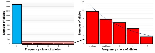
The SFS for a single population – called the 1-dimensional SFS – this is very easy to visualise as a concept. In essence, it’s just a frequency distribution of all the alleles within our dataset. Generally, the distribution follows an exponential shape, with many more rare (e.g. ‘singletons’) alleles than there are common ones. However, the exact shape of the SFS is determined by the history of the population, and like other analyses under coalescent theory we can use our understanding of the interaction between demographic history and current genetic variation to study past events.

1DSFS example.jpg
An example of the 1DSFS for a single population, taken from a real dataset from my PhD. Left: the full site-frequency spectrum, counting how many alleles (y-axis) occur a certain number of times (categories of the x-axis) within the population. In this example, as in most species, the vast majority of our DNA sequence is non-variable (frequency = 0). Given the huge disparity in number of non-variable sites, we often select on the variable ones (and even then, often discard the 1 category to remove potential sequencing errors) and get a graph more like the right. Right: the ‘realistic’ 1DSFS for the population, showing a general exponential decline (the blue trendline) for the more frequent classes. This is pretty standard for an SFS. ‘Singleton’ and ‘doubleton’ are alternative names for ‘alleles which occur once’ and ‘alleles which occur twice’ in an SFS.

Expanding the SFS to multiple populations

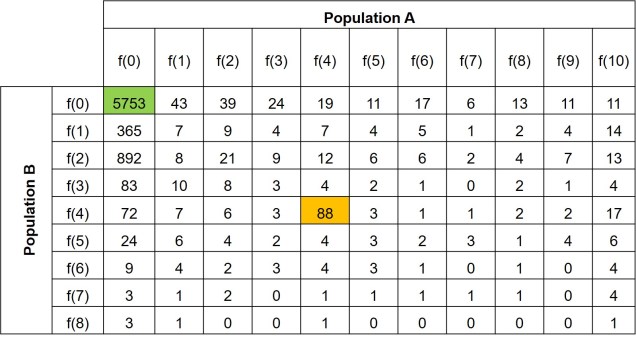
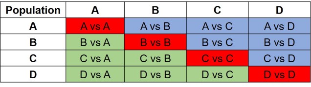
Further to this, we can expand the site-frequency spectrum to compare across populations. Instead of having a simple 1-dimensional frequency distribution, for a pair of populations we can have a grid. This grid specifies how often a particular allele occurs at a certain frequency in Population A and at a different frequency in Population B. This can also be visualised quite easily, albeit as a heatmap instead. We refer to this as the 2-dimensional SFS (2DSFS).

2dsfs example
An example of a 2DSFS, also taken from my PhD research. In this example, we are comparing Population A, containing 5 individuals (as diploid, 2 x 5 = max. of 10 occurrences of an allele) with Population B, containing 4 individuals. Each row denotes the frequency at which a certain allele occurs in Population whilst the columns indicate the frequency a certain allele occurs in Population A. Each cell therefore indicates the number of alleles that occur at the exact frequency of the corresponding row and column. For example, the first cell (highlighted in green) indicates the number of alleles which are not found in either Population A or Population B (this dataset is a subsample from a larger one). The yellow cell indicates the number of alleles which occur 4 times in Population and also 4 times in Population A. This could mean that in one of those Populations 4 individuals have one copy of that allele each, or two individuals have two copies of that allele, or that one has two copies and two have one copy. The exact composition of how the alleles are spread across samples within each population doesn’t matter to the overall SFS.

The same concept can be expanded to even more populations, although this gets harder to represent visually. Essentially, we end up with a set of different matrices which describe the frequency of certain alleles across all of our populations, merging them together into the joint SFS. For example, a joint SFS of 4 populations would consist of 6 (4 x 4 total comparisons – 4 self-comparisons, then halved to remove duplicate comparisons) 2D SFSs all combined together. To make sense of this, check out the diagrammatic tables below.

populations for jsfs
A summary of the different combinations of 2DSFSs that make up a joint SFS matrix. In this example we have 4 different populations (as described in the above text). Red cells denote comparisons between a population and itself – which is effectively redundant. Green cells contain the actual 2D comparisons that would be used to build the joint SFS: the blue cells show the same comparisons but in mirrored order, and are thus redundant as well.
annotated jsfs heatmap
Expanding the above jSFS matrix to the actual data, this matrix demonstrates how the matrix is actually a collection of multiple 2DSFSs. In this matrix, one particular cell demonstrates the number of alleles which occur at frequency x in one population and frequency y in another. For example, if we took the cell in the third row from the top and the fourth column from the left, we would be looking at the number of alleles which occur twice in Population B and three times in Population A. The colour of this cell is moreorless orange, indicating that ~50 alleles occur at this combination of frequencies. As you may notice, many population pairs show similar patterns, except for the Population C vs Population D comparison.

The different forms of the SFS

Which alleles we choose to use within our SFS is particularly important. If we don’t have a lot of information about the genomics or evolutionary history of our study species, we might choose to use the minor allele frequency (MAF). Given that SNPs tend to be biallelic, for any given locus we could have Allele A or Allele B. The MAF chooses the least frequent of these two within the dataset and uses that in the summary SFS: since the other allele’s frequency would just be 2N – the frequency of the other allele, it’s not included in the summary. An SFS made of the MAF is also referred to as the folded SFS.

Alternatively, if we know some things about the genetic history of our study species, we might be able to divide Allele A and Allele B into derived or ancestral alleles. Since SNPs often occur as mutations at a single site in the DNA, one allele at the given site is the new mutation (the derived allele) whilst the other is the ‘original’ (the ancestral allele). Typically, we would use the derived allele frequency to construct the SFS, since under coalescent theory we’re trying to simulate that mutation event. An SFS made of the derived alleles only is also referred to as the unfolded SFS.

Applications of the SFS

How can we use the SFS? Well, it can moreorless be used as a summary of genetic variation for many types of coalescent-based analyses. This means we can make inferences of demographic history (see here for more detailed explanation of that) without simulating large and complex genetic sequences and instead use the SFS. Comparing our observed SFS to a simulated scenario of a bottleneck and comparing the expected SFS allows us to estimate the likelihood of that scenario.

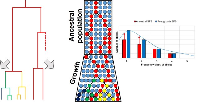
For example, we would predict that under a scenario of a recent genetic bottleneck in a population that alleles which are rare in the population will be disproportionately lost due to genetic drift. Because of this, the overall shape of the SFS will shift to the right dramatically, leaving a clear genetic signal of the bottleneck. This works under the same theoretical background as coalescent tests for bottlenecks.

SFS shift from bottleneck example.jpg
A representative example of how a bottleneck causes a shift in the SFS, based on a figure from a previous post on the coalescentCentre: the diagram of alleles through time, with rarer variants (yellow and navy) being lost during the bottleneck but more common variants surviving (red). Left: this trend is reflected in the coalescent trees for these alleles, with red crosses indicating the complete loss of that allele. Right: the SFS from before (in red) and after (in blue) the bottleneck event for the alleles depicted. Before the bottleneck, variants are spread in the usual exponential shape: afterwards, however, a disproportionate loss of the rarer variants causes the distribution to flatten. Typically, the SFS would be built from more alleles than shown here, and extend much further.

Contrastingly, a large or growing population will have a larger number of rare (i.e. unique) alleles from the sudden growth and increase in genetic variation. Thus, opposite to the bottleneck the SFS distribution will be biased towards the left end of the spectrum, with an excess of low-frequency variants.

SFS shift from expansion example.jpg
A similar diagram as above, but this time with an expansion event rather than a bottleneck. The expansion of the population, and subsequent increase in Ne, facilitates the mutation of new alleles from genetic drift (or reduced loss of alleles from drift), causing more new (and thus rare) alleles to appear. This is shown by both the coalescent tree (left) and a shift in the SFS (right).

The SFS can even be used to detect alleles under natural selection. For strongly selected parts of the genome, alleles should occur at either high (if positively selected) or low (if negatively selected) frequency, with a deficit of more intermediate frequencies.

Adding to the analytical toolbox

The SFS is just one of many tools we can use to investigate the demographic history of populations and species. Using a combination of genomic technologies, coalescent theory and more robust analytical methods, the SFS appears to be poised to tackle more nuanced and complex questions of the evolutionary history of life on Earth.

Mr. Gorbachev, tear down this (pay)wall

The dreaded paywall

For anyone who absorbs their news and media through the Internet (hello, welcome to the 21st Century), you would undoubtedly be familiar with a few frustrating and disingenuous aspects of media such as clickbait headlines and targeted advertising. Another one that might aggravate the common reader is Ol’ Reliable, the paywall – blocking access to an article unless some volume of money is transferred to the publisher, usually through a subscription basis. You might argue that this is a necessary evil, or that rewarding well-written pieces and informative journalism through monetary means might lead to the free market starving poor media (extremely optimistically). Or you might argue that the paywall is morally corrupt and greedy, and just another way to extort money out of hapless readers.

Paywalls.jpg
Yes, that is a literal paywall. And no, I don’t do subtlety.

Accessibility in science

I’m loathe to tell that you that even science, the powerhouse of objectivity with peer-review to increase accountability, is stifled by the weight of corporate greed. You may notice this from some big name journals, like Nature and Science – articles cost money to access, either at the individual level (e.g. per individual article, or as a subscription for a single person for a year) or for an entire institution (such as universities). To state that these paywalls are exorbitantly priced would be a tremendous understatement – for reference, an institution subscription to the single journal Nature (one of 2,512 journals listed under the conglomerate of Springer Nature) costs nearly $8,000 per year. A download of a single paper often costs around $30 for a curious reader.

Some myths about the publishing process

You might be under the impression, as above, that this money goes towards developing good science and providing a support network for sharing and distributing scientific research. I wish you were right. In his book ‘The Effective Scientist’, Professor Corey Bradshaw describes the academic publishing process as “knowledge slavery”, and no matter how long I spend thinking about this blog post would I ever come up with a more macabre yet apt description. And while I highly recommend his book for a number of reasons, his summary and interpretation of how publishing in science actually works (both the strengths and pitfalls) is highly informative and representative.

There are a number of different aspects about publishing in science that make it so toxic to researchers. For example, the entirety of the funds acquired from the publishing process goes to the publishing institution – none of it goes to the scientists that performed and wrote the work, none to the scientists who reviewed and critiqued the paper prior to publication, and none to the institutions who provided the resources to develop the science. In fact, the perception is that if you publish science in a journal, especially high-ranking ones, it should be an honour just to have your paper in that journal. You got into Nature – what more do you want?

Publishing cycle.jpg
The alleged cycle of science. You do Good Science; said Good Science gets published in an equally Good Journal; the associated pay increase (not from the paper itself, of course, but by increasing success rates of grant applications and collaborations) helps to fund the next round of Good Science and the cost of publishing in a Good Journal. Unfortunately, and critically, the first step into the cycle (the yellow arrow) is remarkably difficult and acts as a barrier to many researchers (many of whom do Very Good Science).

Open Access journals

Thankfully, some journals exist which publish science without the paywall: we refer to these as ‘Open Access’ (OA) journals. Although the increased accessibility is undoubtedly a benefit for the spread of scientific knowledge, the reduced revenue often means that a successful submission comes with an associated cost. This cost is usually presented as an ‘article processing charge’: for a paper in a semi-decent journal, this can be upwards of thousands of dollars for a single paper. Submitting to an OA journal can be a bit of a delicate balance: the increased exposure, transparency and freedom to disseminate research is a definite positive for scientists, but the exorbitant costs that can be associated with OA journals can preclude less productive or financially robust labs from publishing in them (regardless of the quality of science produced).

Open access logo.png
The logo for Open Access journals, originally designed by PLoS.

Manuscripts and ArXives

There is somewhat of a counter culture to the rigorous tyranny of scientific journals: some sites exist where scientists can freely upload their manuscripts and articles without a paywall or submission cost. Naturally, the publishing industry reviles this and many of these are not strictly legal (since you effectively hand over almost all publishing rights to the journal at submission). The most notable of these is Sci-Hub, which uses various techniques (including shifting through different domain names in different countries) to bypass paywalls.

Other more user-generated options exist, such as the different subcategories of ArXiv, where users can upload their own manuscripts free of charge and without a paywall and predominantly prior to the peer-review process. By being publically uploaded, ArXiv sites allow scientists to broaden the peer-review process beyond a few journal-selected reviewers. There is still some screening process when submitting to ArXiv to filter out non-scientific articles, but the overall method is much more transparent and scientist-friendly than a typical publishing corporation. For articles that have already been published, other sites such as Researchgate often act as conduits for sharing research (either those obscured by paywalls, despite copyright issues, or those freely accessible by open access).

You might also have heard through the grapevine that “scientists are allowed to send you PDFs of their research if you email them.” This is a bit of a dubious copyright loophole: often, this is not strictly within the acceptable domain of publishing rights as the journal that has published this research maintains all copyrights to the work (clever). Out of protest, many scientists may send their research to interested parties, often with the caveat of not sharing it anywhere else or in manuscript form (as opposed to the finalised published article). Regardless, scientists are more than eager to share their research however they can.

Summary table.jpg
A summary of some of the benefits and detriments of each journal type. For articles published in pre-print sites there is still the intention of (at some date) publishing the article under one of the other two official journal models (and thereof are not mutually exclusive).

Civil rights and access to science

There are a number of both empirical and philosophical reasons why free access to science is critically important for all people. At least one of these (among many others) is based on your civil rights. Scientific research is incredibly expensive, and is often funded through a number of grants from various sources, among the most significant of which includes government-funded programs such as the Australian Research Council (ARC).

Where does this money come from? Well, indirectly, you (if you pay your taxes, anyway). While this connection can be at times frustrating for scientists – particularly if there is difficulty in communicating the importance of your research due to a lack of or not-readily-transparent commercial, technological or medical impact of the work – the logic applies to access to scientific data and results, too. As someone who has contributed monetarily to the formation and presentation of scientific work, it is your capitalist right to have access to the results of that work. Although privatisation ultimately overpowers this in the publishing world, there is (in my opinion) a strong moral philosophy behind demanding access to the results of the research you have helped to fund.

Walled off from research

Anyone who has attempted to publish in the scientific literature is undoubtedly keenly aware of the overt corruption and inadequacy of the system. Private businesses hold a monopoly on the dissemination of scientific research, and although science tries to overcome this process, it is a pervasive structure. However, some changes are in process which are seeking to re-invent the way we handle the publishing of scientific research and with strong support from the general public there is opportunity to minimise the damage that private publication businesses proliferate.

Two Worlds: contrasting Australia’s temperate regions

Temperate Australia

Australia is renowned for its unique diversity of species, and likewise for the diversity of ecosystems across the island continent. Although many would typically associate Australia with the golden sandy beaches, palm trees and warm weather of the tropical east coast, other ecosystems also hold both beautiful and interesting characteristics. Even the regions that might typically seem the dullest – the temperate zones in the southern portion of the continent – themselves hold unique stories of the bizarre and wonderful environmental history of Australia.

The two temperate zones

Within Australia, the temperate zone is actually separated into two very distinct and separate regions. In the far south-western corner of the continent is the southwest Western Australia temperate zone, which spans a significant portion. In the southern eastern corner, the unnamed temperate zone spans from the region surrounding Adelaide at its westernmost point, expanding to the east and encompassing Tasmanian and Victoria before shifting northward into NSW. This temperate zones gradually develops into the sub-tropical and tropical climates of more northern latitudes in Queensland and across to Darwin.


Labelled Koppen-Geiger map
The climatic classification (Koppen-Geiger) of Australia’s ecosystems, derived from the Atlas of Living Australia. The light blue region highlights the temperate zones discussed here, with an isolated region in the SW and the broader region of the SE as it transitions into subtropical and tropical climates northward.

The divide separating these two regions might be familiar to some readers – the Nullarbor Plain. Not just a particularly good location for fossils and mineral ores, the Nullarbor Plain is an almost perfectly flat arid expanse that stretches from the western edge of South Australia to the temperate zone of the southwest. As the name suggests, the plain is totally devoid of any significant forestry, owing to the lack of available water on the surface. This plain is a relatively ancient geological structure, and finished forming somewhere between 14 and 16 million years ago when tectonic uplift pushed a large limestone block upwards to the surface of the crust, forming an effective drain for standing water with the aridification of the continent. Thus, despite being relatively similar bioclimatically, the two temperate zones of Australia have been disconnected for ages and boast very different histories and biota.

Elevation map of NP.jpg
A map of elevation across the Australian continent, also derived from the Atlas of Living Australia. The dashed black line roughly outlines the extent of the Nullarbor Plain, a massively flat arid expanse.

The hotspot of the southwest

The southwest temperate zone – commonly referred to as southwest Western Australia (SWWA) – is an island-like bioregion. Isolated from the rest of the temperate Australia, it is remarkably geologically simple, with little topographic variation (only the Darling Scarp that separates the lower coast from the higher elevation of the Darling Plateau), generally minor river systems and low levels of soil nutrients. One key factor determining complexity in the SWWA environment is the isolation of high rainfall habitats within the broader temperate region – think of islands with an island.

SSWA environment.jpg
A figure demonstrating the environmental characteristics of SWWA, using data from the Atlas of Living AustraliaLeft: An elevation map of the region, showing some mountainous variation, but only one significant steep change along the coast (blue area). Right: A summary of 19 different temperature and precipitation variables, showing a relatively weak gradient as the region shifts inland.

Despite the lack of geological complexity and the perceived diversity of the tropics, the temperate zone of SWWA is the only internationally recognised biodiversity hotspot within Australia. As an example, SWWA is inhabited by ~7,000 different plant species, half of which are endemic to the region. Not to discredit the impressive diversity of the rest of the continent, of course. So why does this area have even higher levels of species diversity and endemism than the rest of mainland Australia?

speciation patterns in SWWA.jpg
A demonstration of some of the different patterns which might explain the high biodiversity of SWWA, from Rix et al. (2015). These predominantly relate to different biogeographic mechanisms that might have driven diversification in the region, from survivors of the Gondwana era to the more recent fragmentation of mesic habitats.

Well, a number of factors may play significant roles in determining this. One of these is the ancient and isolated nature of the region: SWWA has been separated from the rest of Australia for at least 14 million years, with many species likely originating much earlier than this. Because of this isolation, species occurring within SWWA have been allowed to undergo adaptive divergence from their east coast relatives, forming unique evolutionary lineages. Furthermore, the southwest corner of the continent was one of the last to break away from Antarctica in the dismantling of Gondwana >30 million years ago. Within the region more generally, isolation of mesic (wetter) habitats from the broader, arid (xeric) habitats also likely drove the formation of new species as distributions became fragmented or as species adapted to the new, encroaching xeric habitat. Together, this varies mechanisms all likely contributed in some way to the overall diversity of the region.

The temperate south-east of Australia

Contrastingly, the temperate region in the south-east of the continent is much more complex. For one, the topography of the zone is much more variable: there are a number of prominent mountain chains (such as the extended Great Dividing Range), lowland basins (such as the expansive Murray-Darling Basin) and variable valley and river systems. Similarly, the climate varies significantly within this temperate region, with the more northern parts featuring more subtropical climatic conditions with wetter and hotter summers than the southern end. There is also a general trend of increasing rainfall and lower temperatures along the highlands of the southeast portion of the region, and dry, semi-arid conditions in the western lowland region.

MDB map
A map demonstrating the climatic variability across the Murray-Darling Basin (which makes up a large section of the SE temperate zone), from Brauer et al. (2018). The different heat maps on the left describe different types of variables; a) and b) represent temperature variables, c) and d) represent precipitation (rainfall) variables, and e) and f) represent water flow variables. Each variable is a summary of a different set of variables, hence the differences.

A complicated history

The south-east temperate zone is not only variable now, but has undergone some drastic environmental changes over history. Massive shifts in geology, climate and sea-levels have particularly altered the nature of the area. Even volcanic events have been present at some time in the past.

One key hydrological shift that massively altered the region was the paleo-megalake Bungunnia. Not just a list of adjectives, Bungunnia was exactly as it’s described: a historically massive lake that spread across a huge area prior to its demise ~1-2 million years ago. At its largest size, Lake Bungunnia reached an area of over 50,000 km­­­2, spreading from its westernmost point near the current Murray mouth although to halfway across Victoria. Initially forming due to a tectonic uplift event along the coastal edge of the Murray-Darling Basin ~3.2 million years ago, damming the ancestral Murray River (which historically outlet into the ocean much further east than today). Over the next few million years, the size of the lake fluctuated significantly with climatic conditions, with wetter periods causing the lake to overfill and burst its bank. With every burst, the lake shrank in size, until a final break ~700,000 years ago when the ‘dam’ broke and the full lake drained.

Lake Bungunnia map 2.jpg
A map demonstrating the sheer size of paleo megalake Bungunnia at it’s largest extent, taken from McLaren et al. (2012).

Another change in the historic environment readers may be more familiar with is the land-bridge that used to connect Tasmania to the mainland. Dubbed the Bassian Isthmus, this land-bridge appeared at various points in history of reduced sea-levels (i.e. during glacial periods in Pleistocene cycle), predominantly connecting via the still-above-water Flinders and Cape Barren Islands. However, at lower sea-levels, the land bridge spread as far west as King Island: central to this block of land was a large lake dubbed the Bass Lake (creative). The Bassian Isthmus played a critical role in the migration of many of the native fauna of Tasmania (likely including the Indigenous peoples of the now-island), and its submergence and isolation leads to some distinctive differences between Tasmanian and mainland biota. Today, the historic presence of the Bassian Isthmus has left a distinctive mark on the genetic make-up of many species native to the southeast of Australia, including dolphins, frogs, freshwater fishes and invertebrates.

Bass Strait bathymetric contours.jpg
An elevation (Etopo1) map demonstrating the now-underwater land bridge between Tasmania and the mainland. Orange colours denote higher areas whilst light blue represents lower sections.

Don’t underestimate the temperates

Although tropical regions get most of the hype for being hotspots of biodiversity, the temperate zones of Australia similarly boast high diversity, unique species and document a complex environmental history. Studying how the biota and environment of the temperate regions has changed over millennia is critical to predicting the future effects of climatic change across large ecosystems.

The reality of neutrality

The neutral theory 

Many, many times within The G-CAT we’ve discussed the difference between neutral and selective processes, DNA markers and their applications in our studies of evolution, conservation and ecology. The idea that many parts of the genome evolve under a seemingly random pattern – largely dictated by genome-wide genetic drift rather than the specific force of natural selection – underpins many demographic and adaptive (in outlier tests) analyses.

This is based on the idea that for genes that are not related to traits under selection (either positively or negatively), new mutations should be acquired and lost under predominantly random patterns. Although this accumulation of mutations is influenced to some degree by alternate factors such as population size, the overall average of a genome should give a picture that largely discounts natural selection. But is this true? Is the genome truly neutral if averaged?

Non-neutrality

First, let’s take a look at what we mean by neutral or not. For genes that are not under selection, alleles should be maintained at approximately balanced frequencies and all non-adaptive genes across the genome should have relatively similar distribution of frequencies. While natural selection is one obvious way allele frequencies can be altered (either favourably or detrimentally), other factors can play a role.

As stated above, population sizes have a strong impact on allele frequencies. This is because smaller populations are more at risk of losing rarer alleles due to random deaths (see previous posts for a more thorough discussion of this). Additionally, genes which are physically close to other genes which are under selection may themselves appear to be under selection due to linkage disequilibrium (often shortened to ‘LD’). This is because physically close genes are more likely to be inherited together, thus selective genes can ‘pull’ neighbours with them to alter their allele frequencies.

Linkage disequilibrium figure
An example of how linkage disequilibrium can alter allele frequency of ‘neutral’ parts of the genome as well. In this example, only one part of this section of the genome is selected for: the green gene. Because of this positive selection, the frequency of a particular allele at this gene increases (the blue graph): however, nearby parts of the genome also increase in frequency due to their proximity to this selected gene, which decreases with distance. The extent of this effect determines the size of the ‘linkage block’ (see below).

Why might ‘neutral’ models not be neutral?

The assumption that the vast majority of the genome evolves under neutral patterns has long underpinned many concepts of population and evolutionary genetics. But it’s never been all that clear exactly how much of the genome is actually evolving neutrally or adaptively. How far natural selection reaches beyond a single gene under selection depends on a few different factors: let’s take a look at a few of them.

Linked selection

As described above, physically close genes (i.e. located near one another on a chromosome) often share some impacts of selection due to reduced recombination that occurs at that part of the genome. In this case, even alleles that are not adaptive (or maladaptive) may have altered frequencies simply due to their proximity to a gene that is under selection (either positive or negative).

Recombination blocks and linkage figure
A (perhaps familiar) example of the interaction between recombination (the breaking and mixing of different genes across chromosomes) and linkage disequilibrium. In this example, we have 5 different copies of a part of the genome (different coloured sequences), which we randomly ‘break’ into separate fragments (breaks indicated by the dashed lines). If we focus on a particular base in the sequence (the yellow A) and count the number of times a particular base pair is on the same fragment, we can see how physically close bases are more likely to be coinherited than further ones (bottom column graph). This makes mathematical sense: if two bases are further apart, you’re more likely to have a break that separates them. This is the very basic underpinning of linkage and recombination, and the size of the region where bases are likely to be coinherited is called the ‘linkage block’.

Under these circumstances, for a region of a certain distance (dubbed the ‘linkage block’) around a gene under selection, the genome will not truly evolve neutrally. Although this is simplest to visualise as physically linked sections of the genome (i.e. adjacent), linked genes do not necessarily have to be next to one another, just linked somehow. For example, they may be different parts of a single protein pathway.

The extent of this linkage effect depends on a number of other factors such as ploidy (the number of copies of a chromosome a species has), the size of the population and the strength of selection around the central locus. The presence of linkage and its impact on the distribution of genetic diversity (LD) has been well documented within evolutionary and ecological genetic literature. The more pressing question is one of extent: how much of the genome has been impacted by linkage? Is any of the genome unaffected by the process?

Background selection

One example of linked selection commonly used to explain the proliferation of non-neutral evolution within the genome is ‘background selection’. Put simply, background selection is the purging of alleles due to negative selection on a linked gene. Sometimes, background selection is expanded to include any forms of linked selection.

Background selection figure .jpg
A cartoonish example of how background selection affects neighbouring sections of the genome. In this example, we have 4 genes (A, B, C and D) with interspersing neutral ‘non-gene’ sections. The allele for Gene B is strongly selected against by natural selection (depicted here as the Banhammer of Selection). However, the Banhammer is not very precise, and when decreasing the frequency of this maladaptive Gene B allele it also knocks down the neighbouring non-gene sections. Despite themselves not being maladaptive, their allele frequencies are decreased due to physical linkage to Gene B.

Under the first etymology of background selection, the process can be divided into two categories based on the impact of the linkage. As above, one scenario is the purging of neutral alleles (and therefore reduction in genetic diversity) as it is associated with a deleterious maladaptive gene nearby. Contrastingly, some neutral alleles may be preserved by association with a positively selected adaptive gene: this is often referred to as ‘genetic hitchhiking’ (which I’ve always thought was kind of an amusing phrase…).

Genetic hitchhiking picture.jpg
Definitely not how genetic hitchhiking works.

The presence of background selection – particularly under the ‘maladaptive’ scenario – is often used as a counter-argument to the ‘paradox in variation’. This paradox was determined by evolutionary biologist Richard Lewontin, who noted that despite massive differences in population sizes across the many different species on Earth, the total amount of ‘neutral’ genetic variation does not change significantly. In fact, he observed no clear relationship (directly) between population size and neutral variation. Many years after this observation, the influence of background selection and genetic hitchhiking on the distribution of genomic diversity helps to explain how the amount of neutral genomic variation is ‘managed’, and why it doesn’t vary excessively across biota.

What does it mean if neutrality is dead?

This findings have significant implications for our understanding of the process of evolution, and how we can detect adaptation within the genome. In light of this research, there has been heated discussion about whether or not neutral theory is ‘dead’, or a useful concept.

Genome wide allele frequency figure.jpg
A vague summary of how a large portion of the genome might not actually be neutral. In this section of the genome, we have neutral (blue), maladaptive (red) and adaptive (green) elements. Natural selection either favours, disfavours, or is ambivalent about each of this sections aloneHowever, there is significant ‘spill-over’ around regions of positively or negatively selected sections, which causes the allele frequency of even the neutral sections to fluctuate widely. The blue dotted line represents this: when the line is above the genome, allele frequency is increased; when it is below it is decreased. As we travel along this section of the genome, you may notice it is rarely ever in the middle (the so-called ‘neutral‘ allele frequency, in line with the genome).

Although I avoid having a strong stance here (if you’re an evolutionary geneticist yourself, I will allow you to draw your own conclusions), it is my belief that the model of neutral theory – and the methods that rely upon it – are still fundamental to our understanding of evolution. Although it may present itself as a more conservative way to identify adaptation within the genome, and cannot account for the effect of the above processes, neutral theory undoubtedly presents itself as a direct and well-implemented strategy to understand adaptation and demography.

The folly of absolute dichotomies

Divide and conquer (nothing)

Divisiveness is becoming quickly apparent as a plague on the modern era. The segregation and categorisation of people – whether politically, spiritually or morally justified – permeates throughout the human condition and in how we process the enormity of the Homo sapien population. The idea that the antithetic extremes form two discrete categories (for example, the waning centrist between ‘left’ vs. ‘right’ political perspectives) is widely employed in many aspects of the world.

But how pervasive is this pattern? How well can we summarise, divide and categorise people? For some things, this would appear innately very easy to do – one of the most commonly evoked divisions in people is that between men and women. But the increasingly charged debate around concepts of both gender and sex (and sexuality as a derivative, somewhat interrelated concept) highlights the inconsistency of this divide.

The ‘sex’ and ‘gender’ arguments

The most commonly used argument against ‘alternative’ concepts of either gender of sex – the binary states of a ‘man’ with a ‘male’ body and a ‘female’ with a ‘female’ body – is often based on some perception of “biologically reality.” As a (trainee) biologist, let me make this apparently clear that such confidence and clarity of “reality” in many, if not all, biological subdisciplines is absurd (e.g. “nature vs. nurture”). Biologists commonly acknowledge (and rely upon) the realisation that life in all of its constructs is unfathomably diverse, unique, and often difficult to categorise. Any impression of being able to do so is a part of the human limitation to process concepts without boundaries.

Genderbread-Person figure
A great example of the complex nature of human sex and gender. You’ll notice that each category is itself a spectrum: even Biological Sex is not a clearly binary system. In fact, even this representation likely simplifies the complexity of human identity and sexuality given that each category is only a single linear scale (e.g. pansexuality and asexuality aren’t on the Sexual Orientation gradient), but nevertheless is a good summary. Source: It’s Pronounced METROsexual.

Gender as a binary

In terms of gender identity, I think this is becoming (slowly) more accepted over time. That most people have a gender identity somewhere along a multidimensional spectrum is not, for many people, a huge logical leap. Trans people are not mentally ill, not all ‘men’ identify as ‘men’ and certainly not all ‘men’ identify as a ‘man’ under the same characteristics or expression. Human psychology is beautifully complex and to reduce people down to the most simplistic categories is, in my humble opinion, a travesty. The single-variable gender binary cannot encapsulate the full depth of any single person’s identity or personality, and this biologically makes sense.

Sex as a binary

As an extension of the gender debate, sex itself has often been relied upon as the last vestige of some kind of sexual binary. Even for those more supported of trans people, sex is often described as some concrete, biologically, genetically-encoded trait which conveniently falls into its own binary system. Thus, instead of a single binary, people are reduced down to a two-character matrix of sex and gender.

Gender and sex table.jpg
A representative table of the “2 Character Sex and Gender” composition. Although slightly better at allowing for complexity in people’s identities, having 2 binaries instead of 1 doesn’t encapsulate the full breadth of diversity in either sex or gender.

However, the genetics of the definition and expression of sex is in itself a complex network of the expression of different genes and the presence of different chromosomes. Although high-school level biology teaches us that men are XY and women are XX genetically, individual genes within those chromosomes can alter the formation of different sexual organs and the development of a person. Furthermore, additional X or Y chromosomes can further alter the way sexual development occurs in people. Many people who fall in between the two ends of the gender spectrum of Male and Female identify as ‘intersex’.

DSD types table.jpg
A list of some of the known types of ‘Disorders of Sex Development’ (DSDs) which can lead to non-binary sex development in many different ways. Within these categories, there may be multiple genetic mechanisms (e.g. specific mutations) underlying the symptoms. It’s also important to note that while DSD medically describes the conditions of many people, it can be offensive/inappropriate to many intersex people (‘disorder’ can be a heavy word). Source: El-Sherbiny (2013).

You might be under the impression that these are rare ‘genetic disorders’, and don’t count as “real people” (decidedly not my words). But the reality is that intersex people are relatively common throughout the world, and occur roughly as frequently as true redheads or green eyes. Thus, the idea that excluding intersex people from the rest of societal definitions has very little merit, especially from a scientific point of view. Instead, allowing our definitions of both sex and gender to be broad and flexible allows us to incorporate the biological reality of the immense diversity of the world, even just within our own species.

Absolute species concepts

Speaking of species, and relating this paradigm of dichotomy to potentially less politically charged concepts, species themselves are a natural example on the inaccuracy of absolutism. This idea is not a new one, either within The G-CAT or within the broad literature, and species identity has long been regarded as a hive of grey areas. The sheer number of ways a group of organisms can be divided into species (or not, as the case may be) lends to the idea that simplified definitions of what something is or is not will rarely be as accurate as we hope. Even the most commonly employed of characteristics – such as those of the Biological Species Conceptcannot be applied to a number of biological systems such as asexually-reproducing species or complex cases of isolation.

Speciation continuum figure
A figure describing the ‘speciation continuum’ from a previous post on The G-CAT. Now imagine that each Species Concept has it’s own vague species boundary (dotted line): draw 30 of them over the top of one another, and try to pick the exact cut-off between the red and green areas. Even using the imagination, this would be difficult.

The diversity of Life

Anyone who argues a biological basis for these concepts is taking the good name of biological science hostage. Diversity underpins the most core aspects of biology (e.g. evolution, communities and ecosystems, medicine) and is a real attribute of living in a complicated world. Downscaling and simplifying the world to the ‘black’ and the ‘white’ discredits the wonder of biology, and acknowledging the ‘outliers’ (especially those that are not actually so far outside the boxes we have drawn) of any trends we may observe in nature is important to understand the complexity of life on Earth. Even if individual components of this post seem debatable to you: always remember that life is infinitely more complex and colourful than we can even imagine, and all of that is underpinned by diversity in one form or another.