Crossing the Wires: why ‘genetic hardwiring’ is not the whole story

The age-old folly of ‘nature vs. nurture’

It should come as no surprise to any reader of The G-CAT that I’m a firm believer against the false dichotomy (and yes, I really do love that phrase) of “nature versus nurture.” Primarily, this is because the phrase gives the impression of some kind of counteracting balance between intrinsic (i.e. usually genetic) and extrinsic (i.e. usually environmental) factors and how they play a role in behaviour, ecology and evolution. While both are undoubtedly critical for adaptation by natural selection, posing this as a black-and-white split removes the possibility of interactive traits.

We know readily that fitness, the measure by which adaptation or maladaptation can be quantified, is the product of both the adaptive value of a certain trait and the environmental conditions said trait occurs in. A trait that might confer strong fitness in white environment may be very, very unfit in another. A classic example is fur colour in mammals: in a snowy environment, a white coat provides camouflage for predators and prey alike; in a rainforest environment, it’s like wearing one of those fluoro-coloured safety vests construction workers wear.

Genetics and environment interactions figure.jpg
The real Circle of Life. Not only do genes and the environment interact with one another, but genes may interact with other genes and environments may be complex and multi-faceted.

Genetically-encoded traits

In the “nature versus nurture” context, the ‘nature’ traits are often inherently assumed to be genetic. This is because genetic traits are intrinsic as a fundamental aspect of life, inheritable (and thus can be passed on and undergo evolution by natural selection) and define the important physiological traits that provide (or prevent) adaptation. Of course, not all of the genome encodes phenotypic traits at all, and even less relate to diagnosable and relevant traits for natural selection to act upon. In addition, there is a bit of an assumption that many physiological or behavioural traits are ‘hardwired’: that is, despite any influence of environment, genes will always produce a certain phenotype.

Adaptation from genetic variation.jpg
A very simplified example of adaptation from genetic variation. In this example, we have two different alleles of a single gene (orange and blue). Natural selection favours the blue allele so over time it increases in frequency. The difference between these two alleles is at least one base pair of DNA sequence; this often arises by mutation processes.

Despite how important the underlying genes are for the formation of proteins and definition of physiology, they are not omnipotent in that regard. In fact, many other factors can influence how genetic traits relate to phenotypic traits: we’ve discussed a number of these in minor detail previously. An example includes interactions across different genes: these can be due to physiological traits encoded by the cumulative presence and nature of many loci (as in quantitative trait loci and polygenic adaptation). Alternatively, one gene may translate to multiple different physiological characters if it shows pleiotropy.

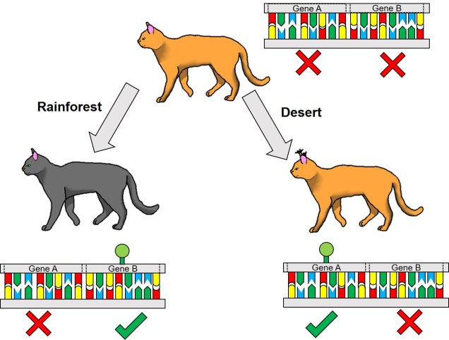
Differential expression

One non-direct way genetic information can impact on the phenotype of an organism is through something we’ve briefly discussed before known as differential expression. This is based on the notion that different environmental pressures may affect the expression (that is, how a gene is translated into a protein) in alternative ways. This is a fundamental underpinning of what we call phenotypic plasticity: the concept that despite having the exact same (or very similar) genes and alleles, two clonal individuals can vary in different traits. The is related to the example of genetically-identical twins which are not necessarily physically identical; this could be due to environmental constraints on growth, behaviour or personality.

Brauer DE figure_cropped
An example of differential expression in wild populations of southern pygmy perch, courtesy of Brauer et al. (2017). In this figure, each column represents a single individual fish, with the phylogenetic tree and coloured boxes at the top indicating the different populations. Each row represents a different gene (this is a subset of 50 from a much larger dataset). The colour of each cell indicates whether the expression of that gene is expressed more (red) or less (blue) than average. As you can see, the different populations can clearly be seen within their expression profiles, with certain genes expressing more or less in certain populations.

From an evolutionary perspective, the ability to translate a single gene into multiple phenotypic traits has a strong advantage. It allows adaptation to new, novel environments without waiting for natural selection to favour adaptive mutations (or for new, adaptive alleles to become available from new mutation events). This might be a fundamental trait that determines which species can become invasive pests, for instance: the ability to establish and thrive in environments very different to their native habitat allows introduced species to quickly proliferate and spread. Even for species which we might not consider ‘invasive’ (i.e. they have naturally spread to new environments), phenotypic plasticity might allow them to very rapidly adapt and evolve into new ecological niches and could even underpin the early stages of the speciation process.

Epigenetics

Related to this alternative expression of genes is another relatively recent concept: that of epigenetics. In epigenetics, the expression and function of genes is controlled by chemical additions to the DNA which can make gene expression easier or more difficult, effectively promoting or silencing genes. Generally, the specific chemicals that are attached to the DNA are relatively (but not always) predictable in their effects: for example, the addition of a methyl group to the sequence is generally associated with the repression of the gene underlying it. How and where these epigenetic markers may in turn be affected by environmental conditions, creating a direct conduit between environmental (‘nurture’) and intrinsic genetic (‘nature’) aspects of evolution.

Epigenetic_mechanisms.jpg
A diagram of different epigenetic factors and the mechanisms by which they control gene expression. Source: Wikipedia.

Typically, these epigenetic ‘marks’ (chemical additions to the DNA) are erased and reset during fertilisation: the epigenetic marks on the parental gametes are removed, and new marks are made on the fertilised embryo. However, it has been shown that this removal process is not 100% effective, and in fact some marks are clearly passed down from parent to offspring. This means that these marks are heritable, and could allow them to evolve similarly to full DNA mutations.

The discovery of epigenetic markers and their influence on gene expression has opened up the possibility of understanding heritable traits which don’t appear to be clearly determined by genetics alone. For example, research into epigenetics suggest that heritable major depressive disorder (MDD) may be controlled by the expression of genes, rather than from specific alleles or genetic variants themselves. This is likely true for a number of traits for which the association to genotype is not entirely clear.

Epigenetic adaptation?

From an evolutionary standpoint again, epigenetics can similarly influence the ‘bang for a buck’ of particular genes. Being able to translate a single gene into many different forms, and for this to be linked to environmental conditions, allows organisms to adapt to a variety of new circumstances without the need for specific adaptive genes to be available. Following this logic, epigenetic variation might be critically important for species with naturally (or unnaturally) low genetic diversity to adapt into the future and survive in an ever-changing world. Thus, epigenetic information might paint a more optimistic outlook for the future: although genetic variation is, without a doubt, one of the most fundamental aspects of adaptability, even horrendously genetically depleted populations and species might still be able to be saved with the right epigenetic diversity.

Epigenetic cats example
A relatively simplified example of adaptation from epigenetic variation. In this example, we have a species of cat; the ‘default’ cat has non-tufted ears and an orange coat. These two traits are controlled by the expression of Genes A and B, respectively: in the top cat, neither gene is expressed. However, when this cat is placed into different environments, the different genes are “switched on” by epigenetic factors (the green markers). In a rainforest environment, the dark foliage makes darker coat colour more adaptive; switching on Gene B allows this to happen. Conversely, in a desert environment switching on Gene A causes the cat to develop tufts on its ears, which makes it more effective at hunting prey hiding in the sands. Note that in both circumstances, the underlying genetic sequence (indicated by the colours in the DNA) is identical: only the expression of those genes change.


Epigenetic research, especially from an ecological/evolutionary perspective, is a very new field. Our understanding of how epigenetic factors translate into adaptability, the relative performance of epigenetic vs. genetic diversity in driving adaptability, and how limited heritability plays a role in adaptation is currently limited. As with many avenues of research, further studies in different contexts, experiments and scopes will reveal further this exciting new aspect of evolutionary and conservation genetics. In short: watch this space! And remember, ‘nature is nurture’ (and vice versa)!

Pressing Ctrl-Z on Life with De-extinction

Note: For some clear, interesting presentations on the topic of de-extinction, and where some of the information for this post comes from, check out this list of TED talks.

The current conservation crisis

The stark reality of conservation in the modern era epitomises the crisis discipline that so often is used to describe it: species are disappearing at an unprecedented rate, and despite our best efforts it appears that they will continue to do so. The magnitude and complexity of our impacts on the environment effectively decimates entire ecosystems (and indeed, the entire biosphere). It is thus our responsibility as ‘custodians of the planet’ (although if I had a choice, I would have sacked us as CEOs of this whole business) to attempt to prevent further extinction of our planet’s biodiversity.

Human CEO example
“….shit.”

If you’re even remotely familiar with this blog, then you would have been exposed to a number of different techniques, practices and outcomes of conservation research and its disparate sub-disciplines (e.g. population genetics, community ecology, etc.). Given the limited resources available to conserve an overwhelming number of endangered species, we attempt to prioritise our efforts towards those most in need, although there is a strong taxonomic bias underpinning them.

At least from a genetic perspective, this sometimes involves trying to understand the nature and potential of adaptation from genetic variation (as a predictor of future adaptability). Or using genetic information to inform captive breeding programs, to allow us to boost population numbers with minimal risk of inbreeding depression. Or perhaps allowing us to describe new, unidentified species which require their own set of targeted management recommendations and political legislation.

Genetic rescue

Yet another example of the use of genetics in conservation management, and one that we have previously discussed on The G-CAT, is the concept of ‘genetic rescue’. This involves actively adding new genetic material from other populations into our captive breeding programs to supplement the amount of genetic variation available for future (or even current) adaptation. While there traditionally has been some debate about the risk of outbreeding depression, genetic rescue has been shown to be an effective method for prolonging the survival of at-risk populations.

super-gene-genetic-rescue-e1549973268851.jpg
How my overactive imagination pictures ‘genetic rescue’.

There’s one catch (well, a few really) with genetic rescue: namely, that one must have other populations to ‘outbreed’ with in order add genetic variation to the captive population. But what happens if we’re too late? What if there are no other populations to supplement with, or those other populations are also too genetically depauperate to use for genetic rescue?

Believe it or not, sometimes it’s not too late to save species, even after they have gone extinct. Which brings us from this (lengthy) introduction to this week’s topic: de-extinction. Yes, we’re literally (okay, maybe not) going to raise the dead.

Necroconservaticon
Your textbook guide to de-extinction. Now banned in 47 countries.

Backbreeding: resurrection by hybridisation

You might wonder how (or even if!) this is possible. And to be frank, it’s extraordinarily difficult. However, it has to a degree been done before, in very specific circumstances. One scenario is based on breeding out a species back into existence: sometimes we refer to this as ‘backbreeding’.

This practice really only applies in a few select scenarios. One requirement for backbreeding to be possible is that hybridisation across species has to have occurred in the past, and generally to a substantial scale. This is important as it allows the genetic variation which defines one of those species to live on within the genome of its sister species even when the original ‘host’ species goes extinct. That might make absolutely zero sense as it stands, so let’s dive into this with a case study.

I’m sure you’ll recognise (at the very least, in name) these handsome fellows below: the Galápagos tortoise. They were a pinnacle in Charles Darwin’s research into the process of evolution by natural selection, and can live for so long that until recently there had been living individuals which would have been able to remember him (assuming, you know, memory loss is not a thing in tortoises. I can’t even remember what I had for dinner two days ago, to be fair). As remarkable as they are, Galápagos tortoises actually comprise 15 different species, which can be primarily determined by the shape of their shells and the islands they inhabit.

Galapagos island and tortoises
A map of the Galápagos archipelago and tortoise species, with extinct species indicated by symbology. Lonesome George was the last known living member of the Pinta Island tortoise, C. abingdonii for reference. Source: Wikipedia.

One of these species, Chelonoidis elephantopus, also known as the Floreana tortoise after their home island, went extinct over 150 years ago, likely due to hunting and tradeHowever, before they all died, some individuals were transported to another island (ironically, likely by mariners) and did the dirty with another species of tortoise: C. becki. Because of this, some of the genetic material of the extinct Floreana tortoise introgressed into the genome of the still-living C. becki. In an effort to restore an iconic species, scientists from a number of institutions attempted to do what sounds like science-fiction: breed the extinct tortoise back to life.

By carefully managing and selectively breeding captive individuals , progressive future generations of the captive population can gradually include more and more of the original extinct C. elephantopus genetic sequence within their genomes. While a 100% resurrection might not be fully possible, by the end of the process individuals with progressively higher proportion of the original Floreana tortoise genome will be born. Although maybe not a perfect replica, this ‘revived’ species is much more likely to serve a similar ecological role to the now-extinct species, and thus contribute to ecosystem stability. To this day, this is one of the closest attempts at reviving a long-dead species.

Is full de-extinction possible?

When you saw the title for this post, you were probably expecting some Jurassic Park level ‘dinosaurs walking on Earth again’ information. I know I did when I first heard the term de-extinction. Unfortunately, contemporary de-extinction practices are not that far advanced just yet, although there have been some solid attempts. Experiments conducted using the genomic DNA from the nucleus of a dead animal, and cloning it within the egg of another living member of that species has effectively cloned an animal back from the dead. This method, however, is currently limited to animals that have died recently, as the DNA degrades beyond use over time.

The same methods have been attempted for some extinct animals, which went extinct relatively recently. Experiments involving the Pyrenean ibex (bucardo) were successful in generating an embryo, but not sustaining a living organism. The bucardo died 10 minutes after birth due to a critical lung condition, as an example.

The challenges and ethics of de-extinction

One might expect that as genomic technologies improve, particularly methods facilitated by the genome-editing allowed from CRISPR/Cas-9 development, that we might one day be able to truly resurrect an extinct species. But this leads to very strongly debated topics of ethics and morality of de-extinction. If we can bring a species back from the dead, should we? What are the unexpected impacts of its revival? How will we prevent history from repeating itself, and the species simply going back extinct? In a rapidly changing world, how can we account for the differences in environment between when the species was alive and now?

Deextinction via necromancy figure
The Chaotic Neutral (?) approach to de-extinction.

There is no clear, simple answer to many of these questions. We are only scratching the surface of the possibility of de-extinction, and I expect that this debate will only accelerate with the research. One thing remains eternally true, though: it is still the distinct responsibility of humanity to prevent more extinctions in the future. Handling the growing climate change problem and the collapse of ecosystems remains a top priority for conservation science, and without a solution there will be no stable planet on which to de-extinct species.

de-extinction meme
You bet we’re gonna make a meme months after it’s gone out of popularity.

The ‘other’ allele frequency: applications of the site frequency spectrum

The site-frequency spectrum

In order to simplify our absolutely massive genomic datasets down to something more computationally feasible for modelling techniques, we often reduce it to some form of summary statistic. These are various aspects of the genomic data that can summarise the variation or distribution of alleles within the dataset without requiring the entire genetic sequence of all of our samples.

One very effective summary statistic that we might choose to use is the site-frequency spectrum (aka the allele frequency spectrum). Not to be confused with other measures of allele frequency which we’ve discussed before (like Fst), the site-frequency spectrum (abbreviated to SFS) is essentially a histogram of how frequent certain alleles are within our dataset. To do this, the SFS classifies each allele into a certain category based on how common it is, tallying up the number of alleles that occur at that frequency. The total number of categories would be the maximum number of possible alleles: for organisms with two copies of every chromosome (‘diploids’, including humans), this means that there are double the number of samples included. For example, a dataset comprised of genomic sequence for 5 people would have 10 different frequency bins.

For one population

The SFS for a single population – called the 1-dimensional SFS – this is very easy to visualise as a concept. In essence, it’s just a frequency distribution of all the alleles within our dataset. Generally, the distribution follows an exponential shape, with many more rare (e.g. ‘singletons’) alleles than there are common ones. However, the exact shape of the SFS is determined by the history of the population, and like other analyses under coalescent theory we can use our understanding of the interaction between demographic history and current genetic variation to study past events.

1DSFS example.jpg
An example of the 1DSFS for a single population, taken from a real dataset from my PhD. Left: the full site-frequency spectrum, counting how many alleles (y-axis) occur a certain number of times (categories of the x-axis) within the population. In this example, as in most species, the vast majority of our DNA sequence is non-variable (frequency = 0). Given the huge disparity in number of non-variable sites, we often select on the variable ones (and even then, often discard the 1 category to remove potential sequencing errors) and get a graph more like the right. Right: the ‘realistic’ 1DSFS for the population, showing a general exponential decline (the blue trendline) for the more frequent classes. This is pretty standard for an SFS. ‘Singleton’ and ‘doubleton’ are alternative names for ‘alleles which occur once’ and ‘alleles which occur twice’ in an SFS.

Expanding the SFS to multiple populations

Further to this, we can expand the site-frequency spectrum to compare across populations. Instead of having a simple 1-dimensional frequency distribution, for a pair of populations we can have a grid. This grid specifies how often a particular allele occurs at a certain frequency in Population A and at a different frequency in Population B. This can also be visualised quite easily, albeit as a heatmap instead. We refer to this as the 2-dimensional SFS (2DSFS).

2dsfs example
An example of a 2DSFS, also taken from my PhD research. In this example, we are comparing Population A, containing 5 individuals (as diploid, 2 x 5 = max. of 10 occurrences of an allele) with Population B, containing 4 individuals. Each row denotes the frequency at which a certain allele occurs in Population whilst the columns indicate the frequency a certain allele occurs in Population A. Each cell therefore indicates the number of alleles that occur at the exact frequency of the corresponding row and column. For example, the first cell (highlighted in green) indicates the number of alleles which are not found in either Population A or Population B (this dataset is a subsample from a larger one). The yellow cell indicates the number of alleles which occur 4 times in Population and also 4 times in Population A. This could mean that in one of those Populations 4 individuals have one copy of that allele each, or two individuals have two copies of that allele, or that one has two copies and two have one copy. The exact composition of how the alleles are spread across samples within each population doesn’t matter to the overall SFS.

The same concept can be expanded to even more populations, although this gets harder to represent visually. Essentially, we end up with a set of different matrices which describe the frequency of certain alleles across all of our populations, merging them together into the joint SFS. For example, a joint SFS of 4 populations would consist of 6 (4 x 4 total comparisons – 4 self-comparisons, then halved to remove duplicate comparisons) 2D SFSs all combined together. To make sense of this, check out the diagrammatic tables below.

populations for jsfs
A summary of the different combinations of 2DSFSs that make up a joint SFS matrix. In this example we have 4 different populations (as described in the above text). Red cells denote comparisons between a population and itself – which is effectively redundant. Green cells contain the actual 2D comparisons that would be used to build the joint SFS: the blue cells show the same comparisons but in mirrored order, and are thus redundant as well.
annotated jsfs heatmap
Expanding the above jSFS matrix to the actual data, this matrix demonstrates how the matrix is actually a collection of multiple 2DSFSs. In this matrix, one particular cell demonstrates the number of alleles which occur at frequency x in one population and frequency y in another. For example, if we took the cell in the third row from the top and the fourth column from the left, we would be looking at the number of alleles which occur twice in Population B and three times in Population A. The colour of this cell is moreorless orange, indicating that ~50 alleles occur at this combination of frequencies. As you may notice, many population pairs show similar patterns, except for the Population C vs Population D comparison.

The different forms of the SFS

Which alleles we choose to use within our SFS is particularly important. If we don’t have a lot of information about the genomics or evolutionary history of our study species, we might choose to use the minor allele frequency (MAF). Given that SNPs tend to be biallelic, for any given locus we could have Allele A or Allele B. The MAF chooses the least frequent of these two within the dataset and uses that in the summary SFS: since the other allele’s frequency would just be 2N – the frequency of the other allele, it’s not included in the summary. An SFS made of the MAF is also referred to as the folded SFS.

Alternatively, if we know some things about the genetic history of our study species, we might be able to divide Allele A and Allele B into derived or ancestral alleles. Since SNPs often occur as mutations at a single site in the DNA, one allele at the given site is the new mutation (the derived allele) whilst the other is the ‘original’ (the ancestral allele). Typically, we would use the derived allele frequency to construct the SFS, since under coalescent theory we’re trying to simulate that mutation event. An SFS made of the derived alleles only is also referred to as the unfolded SFS.

Applications of the SFS

How can we use the SFS? Well, it can moreorless be used as a summary of genetic variation for many types of coalescent-based analyses. This means we can make inferences of demographic history (see here for more detailed explanation of that) without simulating large and complex genetic sequences and instead use the SFS. Comparing our observed SFS to a simulated scenario of a bottleneck and comparing the expected SFS allows us to estimate the likelihood of that scenario.

For example, we would predict that under a scenario of a recent genetic bottleneck in a population that alleles which are rare in the population will be disproportionately lost due to genetic drift. Because of this, the overall shape of the SFS will shift to the right dramatically, leaving a clear genetic signal of the bottleneck. This works under the same theoretical background as coalescent tests for bottlenecks.

SFS shift from bottleneck example.jpg
A representative example of how a bottleneck causes a shift in the SFS, based on a figure from a previous post on the coalescentCentre: the diagram of alleles through time, with rarer variants (yellow and navy) being lost during the bottleneck but more common variants surviving (red). Left: this trend is reflected in the coalescent trees for these alleles, with red crosses indicating the complete loss of that allele. Right: the SFS from before (in red) and after (in blue) the bottleneck event for the alleles depicted. Before the bottleneck, variants are spread in the usual exponential shape: afterwards, however, a disproportionate loss of the rarer variants causes the distribution to flatten. Typically, the SFS would be built from more alleles than shown here, and extend much further.

Contrastingly, a large or growing population will have a larger number of rare (i.e. unique) alleles from the sudden growth and increase in genetic variation. Thus, opposite to the bottleneck the SFS distribution will be biased towards the left end of the spectrum, with an excess of low-frequency variants.

SFS shift from expansion example.jpg
A similar diagram as above, but this time with an expansion event rather than a bottleneck. The expansion of the population, and subsequent increase in Ne, facilitates the mutation of new alleles from genetic drift (or reduced loss of alleles from drift), causing more new (and thus rare) alleles to appear. This is shown by both the coalescent tree (left) and a shift in the SFS (right).

The SFS can even be used to detect alleles under natural selection. For strongly selected parts of the genome, alleles should occur at either high (if positively selected) or low (if negatively selected) frequency, with a deficit of more intermediate frequencies.

Adding to the analytical toolbox

The SFS is just one of many tools we can use to investigate the demographic history of populations and species. Using a combination of genomic technologies, coalescent theory and more robust analytical methods, the SFS appears to be poised to tackle more nuanced and complex questions of the evolutionary history of life on Earth.

The reality of neutrality

The neutral theory 

Many, many times within The G-CAT we’ve discussed the difference between neutral and selective processes, DNA markers and their applications in our studies of evolution, conservation and ecology. The idea that many parts of the genome evolve under a seemingly random pattern – largely dictated by genome-wide genetic drift rather than the specific force of natural selection – underpins many demographic and adaptive (in outlier tests) analyses.

This is based on the idea that for genes that are not related to traits under selection (either positively or negatively), new mutations should be acquired and lost under predominantly random patterns. Although this accumulation of mutations is influenced to some degree by alternate factors such as population size, the overall average of a genome should give a picture that largely discounts natural selection. But is this true? Is the genome truly neutral if averaged?

Non-neutrality

First, let’s take a look at what we mean by neutral or not. For genes that are not under selection, alleles should be maintained at approximately balanced frequencies and all non-adaptive genes across the genome should have relatively similar distribution of frequencies. While natural selection is one obvious way allele frequencies can be altered (either favourably or detrimentally), other factors can play a role.

As stated above, population sizes have a strong impact on allele frequencies. This is because smaller populations are more at risk of losing rarer alleles due to random deaths (see previous posts for a more thorough discussion of this). Additionally, genes which are physically close to other genes which are under selection may themselves appear to be under selection due to linkage disequilibrium (often shortened to ‘LD’). This is because physically close genes are more likely to be inherited together, thus selective genes can ‘pull’ neighbours with them to alter their allele frequencies.

Linkage disequilibrium figure
An example of how linkage disequilibrium can alter allele frequency of ‘neutral’ parts of the genome as well. In this example, only one part of this section of the genome is selected for: the green gene. Because of this positive selection, the frequency of a particular allele at this gene increases (the blue graph): however, nearby parts of the genome also increase in frequency due to their proximity to this selected gene, which decreases with distance. The extent of this effect determines the size of the ‘linkage block’ (see below).

Why might ‘neutral’ models not be neutral?

The assumption that the vast majority of the genome evolves under neutral patterns has long underpinned many concepts of population and evolutionary genetics. But it’s never been all that clear exactly how much of the genome is actually evolving neutrally or adaptively. How far natural selection reaches beyond a single gene under selection depends on a few different factors: let’s take a look at a few of them.

Linked selection

As described above, physically close genes (i.e. located near one another on a chromosome) often share some impacts of selection due to reduced recombination that occurs at that part of the genome. In this case, even alleles that are not adaptive (or maladaptive) may have altered frequencies simply due to their proximity to a gene that is under selection (either positive or negative).

Recombination blocks and linkage figure
A (perhaps familiar) example of the interaction between recombination (the breaking and mixing of different genes across chromosomes) and linkage disequilibrium. In this example, we have 5 different copies of a part of the genome (different coloured sequences), which we randomly ‘break’ into separate fragments (breaks indicated by the dashed lines). If we focus on a particular base in the sequence (the yellow A) and count the number of times a particular base pair is on the same fragment, we can see how physically close bases are more likely to be coinherited than further ones (bottom column graph). This makes mathematical sense: if two bases are further apart, you’re more likely to have a break that separates them. This is the very basic underpinning of linkage and recombination, and the size of the region where bases are likely to be coinherited is called the ‘linkage block’.

Under these circumstances, for a region of a certain distance (dubbed the ‘linkage block’) around a gene under selection, the genome will not truly evolve neutrally. Although this is simplest to visualise as physically linked sections of the genome (i.e. adjacent), linked genes do not necessarily have to be next to one another, just linked somehow. For example, they may be different parts of a single protein pathway.

The extent of this linkage effect depends on a number of other factors such as ploidy (the number of copies of a chromosome a species has), the size of the population and the strength of selection around the central locus. The presence of linkage and its impact on the distribution of genetic diversity (LD) has been well documented within evolutionary and ecological genetic literature. The more pressing question is one of extent: how much of the genome has been impacted by linkage? Is any of the genome unaffected by the process?

Background selection

One example of linked selection commonly used to explain the proliferation of non-neutral evolution within the genome is ‘background selection’. Put simply, background selection is the purging of alleles due to negative selection on a linked gene. Sometimes, background selection is expanded to include any forms of linked selection.

Background selection figure .jpg
A cartoonish example of how background selection affects neighbouring sections of the genome. In this example, we have 4 genes (A, B, C and D) with interspersing neutral ‘non-gene’ sections. The allele for Gene B is strongly selected against by natural selection (depicted here as the Banhammer of Selection). However, the Banhammer is not very precise, and when decreasing the frequency of this maladaptive Gene B allele it also knocks down the neighbouring non-gene sections. Despite themselves not being maladaptive, their allele frequencies are decreased due to physical linkage to Gene B.

Under the first etymology of background selection, the process can be divided into two categories based on the impact of the linkage. As above, one scenario is the purging of neutral alleles (and therefore reduction in genetic diversity) as it is associated with a deleterious maladaptive gene nearby. Contrastingly, some neutral alleles may be preserved by association with a positively selected adaptive gene: this is often referred to as ‘genetic hitchhiking’ (which I’ve always thought was kind of an amusing phrase…).

Genetic hitchhiking picture.jpg
Definitely not how genetic hitchhiking works.

The presence of background selection – particularly under the ‘maladaptive’ scenario – is often used as a counter-argument to the ‘paradox in variation’. This paradox was determined by evolutionary biologist Richard Lewontin, who noted that despite massive differences in population sizes across the many different species on Earth, the total amount of ‘neutral’ genetic variation does not change significantly. In fact, he observed no clear relationship (directly) between population size and neutral variation. Many years after this observation, the influence of background selection and genetic hitchhiking on the distribution of genomic diversity helps to explain how the amount of neutral genomic variation is ‘managed’, and why it doesn’t vary excessively across biota.

What does it mean if neutrality is dead?

This findings have significant implications for our understanding of the process of evolution, and how we can detect adaptation within the genome. In light of this research, there has been heated discussion about whether or not neutral theory is ‘dead’, or a useful concept.

Genome wide allele frequency figure.jpg
A vague summary of how a large portion of the genome might not actually be neutral. In this section of the genome, we have neutral (blue), maladaptive (red) and adaptive (green) elements. Natural selection either favours, disfavours, or is ambivalent about each of this sections aloneHowever, there is significant ‘spill-over’ around regions of positively or negatively selected sections, which causes the allele frequency of even the neutral sections to fluctuate widely. The blue dotted line represents this: when the line is above the genome, allele frequency is increased; when it is below it is decreased. As we travel along this section of the genome, you may notice it is rarely ever in the middle (the so-called ‘neutral‘ allele frequency, in line with the genome).

Although I avoid having a strong stance here (if you’re an evolutionary geneticist yourself, I will allow you to draw your own conclusions), it is my belief that the model of neutral theory – and the methods that rely upon it – are still fundamental to our understanding of evolution. Although it may present itself as a more conservative way to identify adaptation within the genome, and cannot account for the effect of the above processes, neutral theory undoubtedly presents itself as a direct and well-implemented strategy to understand adaptation and demography.

Bringing alleles back together: applications of coalescent theory

Coalescent theory

A recurring analytical method, both within The G-CAT and the broader ecological genetic literature, is based on coalescent theory. This is based on the mathematical notion that mutations within genes (leading to new alleles) can be traced backwards in time, to the point where the mutation initially occurred. Given that this is a retrospective, instead of describing these mutation moments as ‘divergence’ events (as would be typical for phylogenetics), these appear as moments where mutations come back together i.e. coalesce.

There are a number of applications of coalescent theory, and it is particularly fitting process for understanding the demographic (neutral) history of populations and species.

Mathematics of the coalescent

Before we can explore the multitude of applications of the coalescent, we need to understand the fundamental underlying model. The initial coalescent model was described in the 1980s, built upon by a number of different ecologists, geneticists and mathematicians. However, John Kingman is often attributed with the formation of the original coalescent model, and the Kingman’s coalescent is considered the most basic, primal form of the coalescent model.

From a mathematical perspective, the coalescent model is actually (relatively) simple. If we sampled a single gene from two different individuals (for simplicity’s sake, we’ll say they are haploid and only have one copy per gene), we can statistically measure the probability of these alleles merging back in time (coalescing) at any given generation. This is the same probability that the two samples share an ancestor (think of a much, much shorter version of sharing an evolutionary ancestor with a chimpanzee).

Normally, if we were trying to pick the parents of our two samples, the number of potential parents would be the size of the ancestral population (since any individual in the previous generation has equal probability of being their parent). But from a genetic perspective, this is based on the genetic (effective) population size (Ne), multiplied by 2 as each individual carries two copies per gene (one paternal and one maternal). Therefore, the number of potential parents is 2Ne.

Constant Ne and coalescent prob
A graph of the probability of a coalescent event (i.e. two alleles sharing an ancestor) in the immediately preceding generation (i.e. parents) relatively to the size of the population. As one might expect, with larger population sizes there is low chance of sharing an ancestor in the immediately prior generation, as the pool of ‘potential parents’ increases.

If we have an idealistic population, with large Ne, random mating and no natural selection on our alleles, the probability that their ancestor is in this immediate generation prior (i.e. share a parent) is 1/(2Ne). Inversely, the probability they don’t share a parent is 1 − 1/(2Ne). If we add a temporal component (i.e. number of generations), we can expand this to include the probability of how many generations it would take for our alleles to coalesce as (1 – (1/2Ne))t-1 x 1/2Ne.

Variable Ne and coalescent probs
The probability of two alleles sharing a coalescent event back in time under different population sizes. Similar to above, there is a higher probability of an earlier coalescent event in smaller populations as the reduced number of ancestors means that alleles are more likely to ‘share’ an ancestor. However, over time this pattern consistently decreases under all population size scenarios.

Although this might seem mathematically complicated, the coalescent model provides us with a scenario of how we would expect different mutations to coalesce back in time if those idealistic scenarios are true. However, biology is rarely convenient and it’s unlikely that our study populations follow these patterns perfectly. By studying how our empirical data varies from the expectations, however, allows us to infer some interesting things about the history of populations and species.

Testing changes in Ne and bottlenecks

One of the more common applications of the coalescent is in determining historical changes in the effective population size of species, particularly in trying to detect genetic bottleneck events. This is based on the idea that alleles are likely to coalesce at different rates under scenarios of genetic bottlenecks, as the reduced number of individuals (and also genetic diversity) associated with bottlenecks changes the frequency of alleles and coalescence rates.

For a set of k different alleles, the rate of coalescence is determined as k(k – 1)/4Ne. Thus, the coalescence rate is intrinsically linked to the number of genetic variants available: Ne. During genetic bottlenecks, the severely reduced Ne gives the appearance of coalescence rate speeding up. This is because alleles which are culled during the bottleneck event by genetic drift causes only a few (usually common) alleles to make it through the bottleneck, with the mutation and spread of these alleles after the bottleneck. This can be a little hard to think of, so the diagram below demonstrates how this appears.

Bottleneck test figure.jpg
A diagram of how the coalescent can be used to detect bottlenecks in a single population (centre). In this example, we have contemporary population in which we are tracing the coalescence of two main alleles (red and green, respectively). Each circle represents a single individual (we are assuming only one allele per individual for simplicity, but for most animals there are up to two).  Looking forward in time, you’ll notice that some red alleles go extinct just before the bottleneck: they are lost during the reduction in Ne. Because of this, if we measure the rate of coalescence (right), it is much higher during the bottleneck than before or after it. Another way this could be visualised is to generate gene trees for the alleles (left): populations that underwent a bottleneck will typically have many shorter branches and a long root, as many branches will be ‘lost’ by extinction (the dashed lines, which are not normally seen in a tree).

This makes sense from theoretical perspective as well, since strong genetic bottlenecks means that most alleles are lost. Thus, the alleles that we do have are much more likely to coalesce shortly after the bottleneck, with very few alleles that coalesce before the bottleneck event. These alleles are ones that have managed to survive the purge of the bottleneck, and are often few compared to the overarching patterns across the genome.

Testing migration (gene flow) across lineages

Another demographic factor we may wish to test is whether gene flow has occurred across our populations historically. Although there are plenty of allele frequency methods that can estimate contemporary gene flow (i.e. within a few generations), coalescent analyses can detect patterns of gene flow reaching further back in time.

In simple terms, this is based on the idea that if gene flow has occurred across populations, then some alleles will have been transferred from one population to another. Because of this, we would expect that transferred alleles coalesce with alleles of the source population more recently than the divergence time of the two populations. Thus, models that include a migration rate often add it as a parameter specifying the probability than any given allele coalesces with an allele in another population or species (the backwards version of a migration or introgression event). Again, this might be difficult to conceptualise so there’s a handy diagram below.

Migration rate test figure
A similar model of coalescence as above, but testing for migration rate (gene flow) in two recently diverged populations (right). In this example, when we trace two alleles (red and green) back in time, we notice that some individuals in Population 1 coalesce more recently with individuals of Population 2 than other individuals of Population 1 (e.g. for the red allele), and vice versa for the green allele. This can also be represented with gene trees (left), with dashed lines representing individuals from Population 2 and whole lines representing individuals from Population 1. This incomplete split between the two populations is the result of migration transferring genes from one population to the other after their initial divergence (also called ‘introgression’ or ‘horizontal gene transfer’).

Testing divergence time

In a similar vein, the coalescent can also be used to test how long ago the two contemporary populations diverged. Similar to gene flow, this is often included as an additional parameter on top of the coalescent model in terms of the number of generations ago. To convert this to a meaningful time estimate (e.g. in terms of thousands or millions of years ago), we need to include a mutation rate (the number of mutations per base pair of sequence per generation) and a generation time for the study species (how many years apart different generations are: for humans, we would typically say ~20-30 years).

Divergence time test figure.jpg
An example of using the coalescent to test the divergence time between two populations, this time using three different alleles (red, green and yellow). Tracing back the coalescence of each alleles reveals different times (in terms of which generation the coalescence occurs in) depending on the allele (right). As above, we can look at this through gene trees (left), showing variation how far back the two populations (again indicated with bold and dashed lines respectively) split. The blue box indicates the range of times (i.e. a confidence interval) around which divergence occurred: with many more alleles, this can be more refined by using an ‘average’ and later related to time in years with a generation time.


The basic model of testing divergence time with the coalescent is relatively simple, and not all that different to phylogenetic methods. Where in phylogenetics we relate the length of the different branches in the tree to the amount of time that has occurred since the divergence of those branches, with the coalescent we base these on coalescent events, with more coalescent events occurring around the time of divergence. One important difference in the two methods is that coalescent events might not directly coincide with divergence time (in fact, we expect many do not) as some alleles will separate prior to divergence, and some will lag behind and start to diverge after the divergence event.

The complex nature of the coalescent

While each of these individual concepts may seem (depending on how well you handle maths!) relatively simple, one critical issue is the interactive nature of the different factors. Gene flow, divergence time and population size changes will all simultaneously impact the distribution and frequency of alleles and thus the coalescent method. Because of this, we often use complex programs to employ the coalescent which tests and balances the relative contributions of each of these factors to some extent. Although the coalescent is a complex beast, improvements in the methodology and the programs that use it will continue to improve our ability to infer evolutionary history with coalescent theory.