Predicting the future for biodiversity
Conservation biology is frequently referred to as a “crisis discipline“, a status which doesn’t appear to be changing any time soon. Like any response to a crisis, biologists of all walks of life operate under a prioritisation scheme – how can our finite resources be best utilised to save as much biodiversity as possible? This approach requires some knowledge of both current vulnerability and future threat – we need to focus our efforts on those populations and species which are most at-risk of extinction in the near (often immediate) future.
Genomic vulnerability
From an evolutionary perspective, this approach involves understanding which populations will face the greatest adaptive pressure in the future. This can be thought of as a product of two interacting components – one, the current adaptive potential of the given population, and two, the future environmental change the population is expected to experience. Trying to tie these aspects into a single quantifiable trait is the basis of “genomic vulnerability”, a term which was first popularised by Bay et al. 2018 in their landmark paper on the American yellow warbler in Science. Understandably, the paper generated significant attention from the scientific community which saw the broad applicability of the method. Since then, a number of other papers have applied and expanded upon the method to include additional factors (such as land-use changes and migration ability) or using other biological systems.
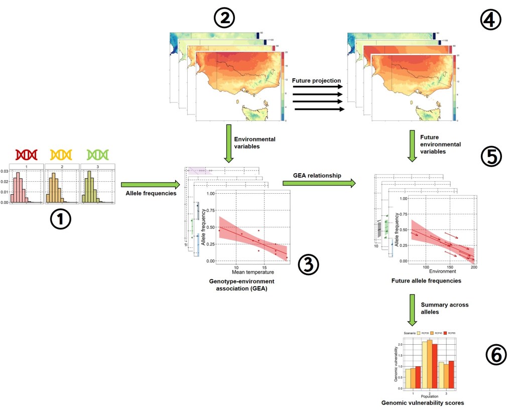
For this post, we’re going to take a brief foray into the process of calculating genomic vulnerability scores. In essence, this involves identifying loci (SNPs) which are associated with environmental variation, and then projecting these onto future climate conditions. Genomic vulnerability can be summarised as the amount of adaptive genetic change in a population required to keep up with climate change. This summary has been significantly simplified (particularly statistically) for clarity – just bear in mind that there are often multiple other pre-processing and validation steps to account for confounding factors and provide more robust inferences.
The Data
Genomic vulnerability requires two main initial inputs – genetic data, in the form of allele frequencies per population, and environmental data where each population occurs. For this post, I used a combination of simulated genetic data and real (empirical) environmental data for the following analyses.
Simulated genetic data
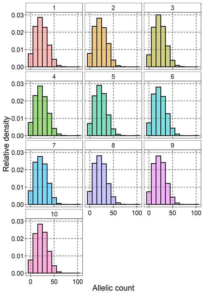
I simulated genetic data for ten populations of a species (I’ll let your own taxonomic biases dictate what you’d like to pretend the species is), each consisting of ten individuals (so 100 total). Using the R package scrime I randomly generate genotypes for 5,000 loci (SNPs) from a normal distribution. That is, for a given SNP each individual was assigned one of two possible alleles (no invariant sites or triallelic loci). Because of this sampling strategy, we can effectively rule out population structure as a confounding factor, but it’s important to remember that the data are not entirely realistic for this reason. Ordinarily, there would be a number of data filtering steps and prior knowledge about the study system to make sure the genetic data are robust.
From this genotypes, I then calculated the frequency of these alleles per population using the dartR package, which acts as the input for the genotype-environment analysis below.
Empirical environmental data
For the environmental data, I chose four different environment variables from across southeast Australia, obtained from the CHELSA climatic database. These come from a larger global database of 19 bioclimatic variables related to temperature and precipitation, which are widely used to estimate species distributions and summarise environmental characteristics driving selection. I chose to use annual mean temperature (Bio1), isothermality (Bio3), total annual precipitation (Bio12) and the seasonality of precipitation (Bio15). I decided on this particular region and these particular variables for a few different reasons:
- I already had the data available from my own PhD work, saving me some processing time.
- From that work, I already know that these variables are not strongly correlated (R > 0.8) with one another, an issue which could impact on genotype-environment associations below.
- The region has notable climatic variation, especially in terms of temperature and climate, which makes it ideal for this approach (especially considering the genetic data are randomly generated and thus not likely to innately show differences between populations).
- It’s relatively easy to obtain future projections of the same variables for the same region from the CHELSA database (this is an important factor further down).
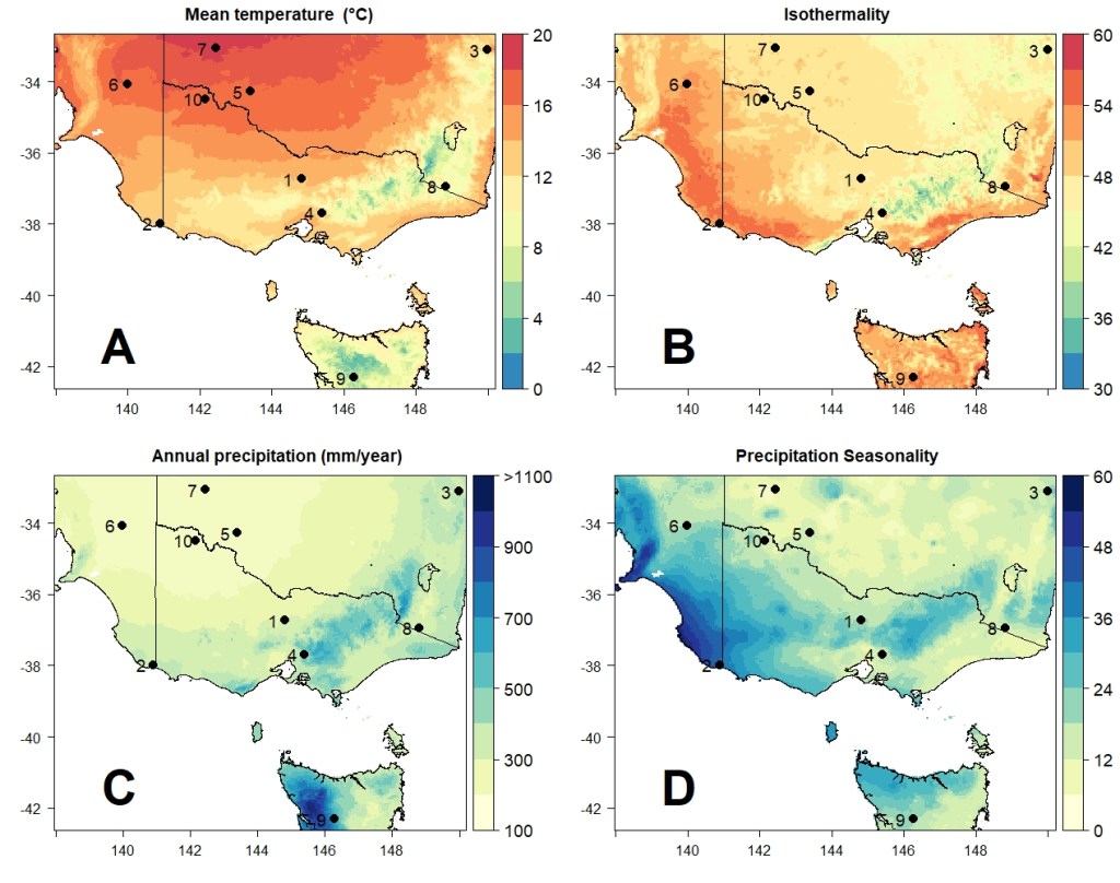
For each of the populations created above, I randomly generated coordinates for their position in southeast Australia (on land only, of course) using the sampleRandom function of the raster R package. This serves to randomly associate the simulated genetic variation with local environmental conditions (without my own bias of manually choosing where to place the populations). Overall, however, they appear to be nicely spread throughout the region.
Genotype-environment association (GEA)
The next major step in the pipeline involves combining these two sources of data to identify genetic variants associated with environment variation – this falls under the scope of “genotype-environment association” (or GEA for short). In essence, GEA approaches seek to detect alleles whose frequency is statistically correlated with environmental variation across the populations. There are a number of statistical approaches to detect this associations, accounting for various confounding factors or types of associations (e.g. linear, exponential, multivariate). One commonly used statistical approach is redundancy analysis (RDA), which is particularly effective at detecting relationships involving multiple alleles and environmental factors simultaneously. RDAs allow for the regression of multiple response variables (allele frequencies) on multiple explanatory variables (environmental variables) simultaneously, seeking to identify which SNPs have allele frequencies which can be linearly explained by components of the environment.
I used an RDA approach based on the AlleleShift R package to identify which of the 5,000 loci showed significant associations with the four environmental variables. I also used the RDA approach described by my colleague Dr. Chris Brauer here, which obtained similar results. I focused on the AlleleShift results as it was much simpler to translate this RDA for future climatic conditions (see below).
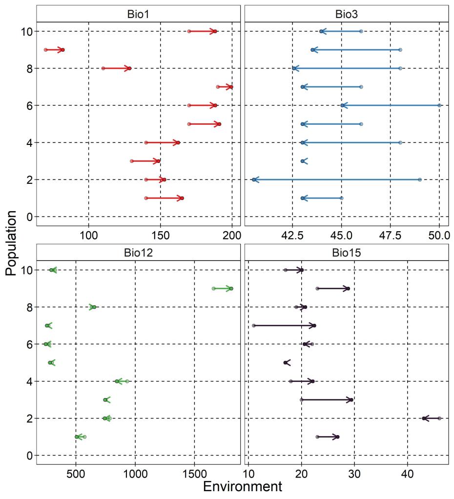
The allele frequencies of most populations were well captured by the RDA model, with strong correlation between RDA-predicted and real allele frequencies (R2 > 0.93), except for Population 1 (R2 = 0.22, mostly driven by one outlier SNP). In total, 72 of the 5,000 loci (1.44%) showed statistically significant associations – however, most of these were only weakly correlated with one of the environmental variables (see histograms below). As is commonly done in GEA approaches, I focus on only those loci with “decent” (R > 0.3) association to at least one environmental variable – this reduced the number to 10 putatively adaptive loci.
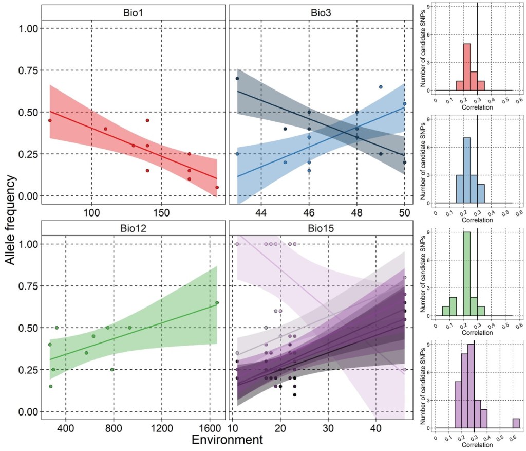
Within the most strongly associated SNPs, it appears that many of them are associated with precipitation seasonality (Bio15), although this might be due to the fact that most populations cluster at either low or high values (i.e. the full range of seasonality is not well sampled across the populations).
The future environment
Next, we need to find a projected environment which can be used to translate these RDA relationships and predict allele frequency changes. Given the unpredictability in future climate change, largely linked to how effectively we control global emissions, we tend to model future climate based on a range of projected scenarios. This may also include using different global circulation models (GCMs), although for simplicity here I use only the BCC-CSM2-MR from the CMIP6 project. This particular model is frequently used in similar types of studies.
These future scenarios take the form of “shared socio-economic pathways” (SSPs) or “representative concentration pathways” (RCPs), which seek to model possible future climatic conditions depending on how well global carbon emissions are controlled. These pathways range from (relatively) mild to severe, and have their own timelines of global climatic change. To represent the range of potential future climates, I obtained the same four environmental variables as above projected under relatively mild (RCP2.6), moderate (RCP4.5) and severe (RCP8.5) climate change using data freely available in the CHELSA database.
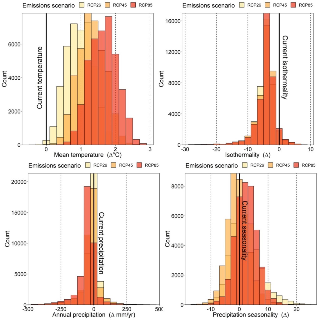
As one might expect, all populations across the region are expected to experience higher mean annual temperatures and lower isothermality (below). However, the other two variables do not change predictably across all populations, with most not showing a huge change in annual precipitation but with a mixture of increasing and decreasing seasonality.
Future allele frequency changes
Next, we use the combination of current allele frequencies per population, the projected future environmental conditions each population is expected to experience, and the relationship (RDA) of the two to estimate how allele frequencies for these adaptive loci are likely to shift over time. This assumes that the relationship of allele frequencies remains constant over time (which it may not), that adaptation to the changing environment is genetic (it may not be), and focuses only on our subset of loci (other important loci might not have been detected, or important environmental factors may not have been included).
This projection is repeated for each locus (of the 10 identified above), per population, and under the three different RCP scenarios. The simplest way of demonstrating this projection would be to assume a total linear relationship of only one locus and one environmental variable at a time, and use the slope of that relationship to project future allele frequencies (as done below). However, the more statistically robust way to do this is to use the RDA model itself for the projection (remembering that this accounts for multivariate relationships). To do this, I predicted future allele frequencies using AlleleShift (count.pred and freq.pred functions) and the established RDA.

Genomic vulnerability scores
The last step is relatively simple compared to the previous one – all we need to obtain a ‘genomic vulnerability score’ is to find a way to summarise all of these predicted allele frequency changes per population. This can be done as simply as an average across all adaptive loci (in this case, all 10 GEA loci) or the sum of all adaptive loci. You could attribute additional penalties here as well – for example, if a population is expected to have an allele frequency change from 0 to 0.5 under climate change, this would require a new variant to be introduced (by mutation or migration). This presents its own challenges, and is more difficult than a population that has to change from 0.2 to 0.7 (same distance), so you might choose to add a value associated with this. For here though, I’ve chosen to just summarise genomic vulnerability as the total sum of projected allele frequency changes.

Closing statement
Genomic vulnerability scores are a convenient measure of predicting the susceptibility of populations to environmental change, and may make significant strides towards helping identify the most at-risk populations of a species. However, the method is relatively simple and is regularly being expanded upon to include additional sources of information. Over time, I suspect genomic vulnerability (in one form or another) will become a staple in conservation genomics research for a diverse array of threatened species: hopefully, this post has been an informative introduction for those seeking to explore the method.

2 thoughts on “A simplified guide to genomic vulnerability”